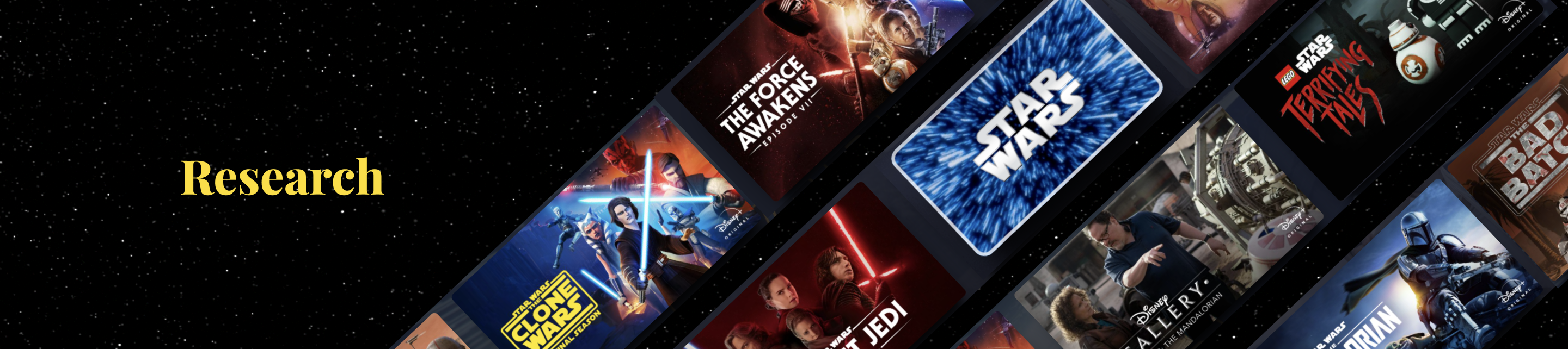
ROLE
Lead Product Designer
TEAM
Product Designer, Project Manager and Developers
LAUNCH DATE
December 2022
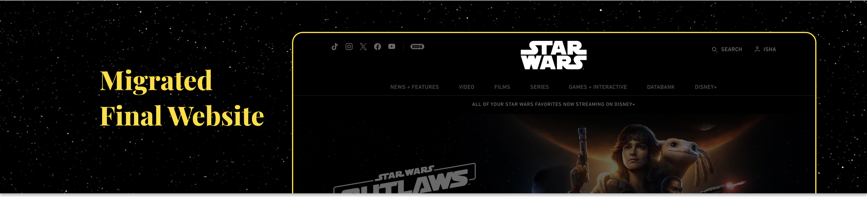
View Live WebsiteOVERVIEW
Migrate Starwars.com from an older "forked" version of Matterhorn, a Content Management System (CMS) to a “shared stack” version. Moving to “shared stack” allowed producers to reuse shareable modules that are used for Disney’s various brands (Nat Geo, Disney, etc.). This created less work for engineers, as they would not need to build the same modules within two different codebases. Additionally, there were Star Wars articles that were within Wordpress using two different codebases which the engineering team needed to update when making changes for Starwars.com.
OPPORTUNITY
During the migration we wanted to enhance the visuals and also use this opportunity to more closely align with Prism, Disney’s internal design system, while staying within the current restraints of Matterhorn. Additionally, prioritize accessibility and WCAG guidelines to make the website accessible to all users.
Recognition
2023 Webby’s Honoree - Websites and Mobile Sites Television, Film & Streaming
Design Goals
Improve User experience
This was an opportunity to enhance the star wars digital product and ensure better user experience with a clean and intuitive design. We wanted to create a visually pleasing and responsive design across all devices. Since Star Wars is a dark theme brand, we wanted to ensure a good contrast between text and background colors while minimizing clutter. To account for SEO, we aimed to integrate more keywords into website's content.
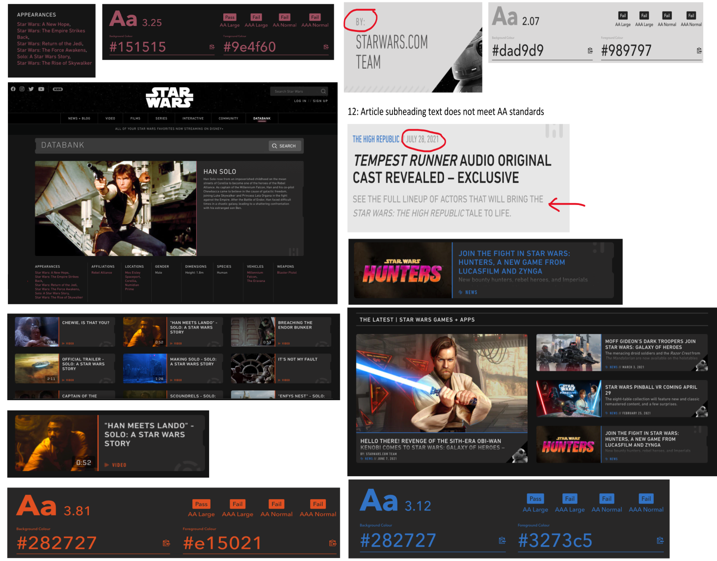
account for accessibility
The existing Star Wars website faced numerous accessibility issues and lacked WCAG compliance. Mainly, colored text and body copy text failed accessibility standards, with contrast issues prevalent on all key pages, including all articles. Our goal was to prioritize inclusivity and ensure the website is accessible for all audiences.
consistent brand identity
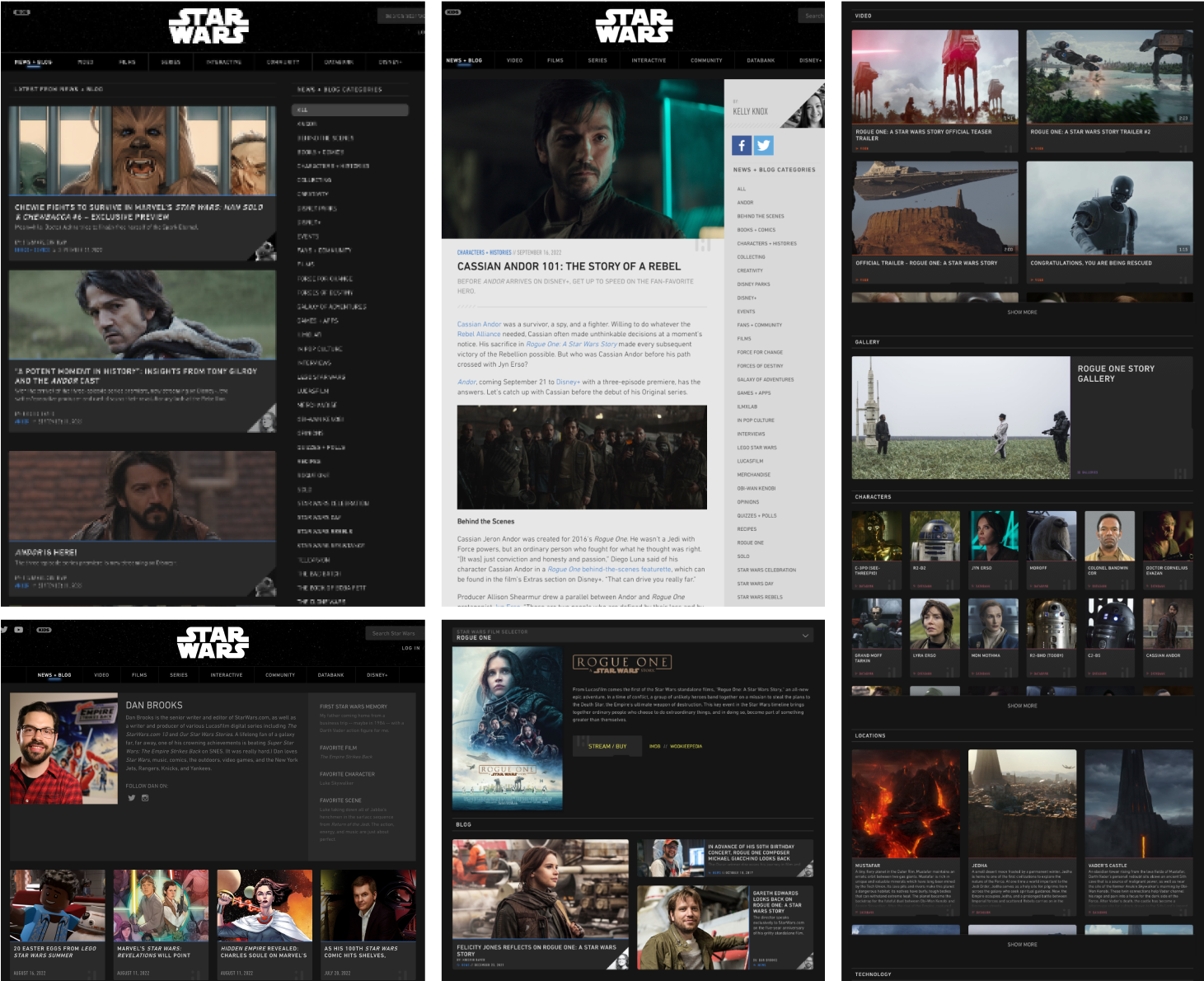
Based on the screens above and below, it becomes evident that the existing Star Wars site was a rainbow of colors, lacking accessibility compliance and a logical usage pattern. With this migration, our aim was to maintain a consistent visual identity and branding. Additionally, establish a cohesive color scheme, and typography while introducing elements from the Star Wars universe to add brand delight and fully immerse users in this experience.
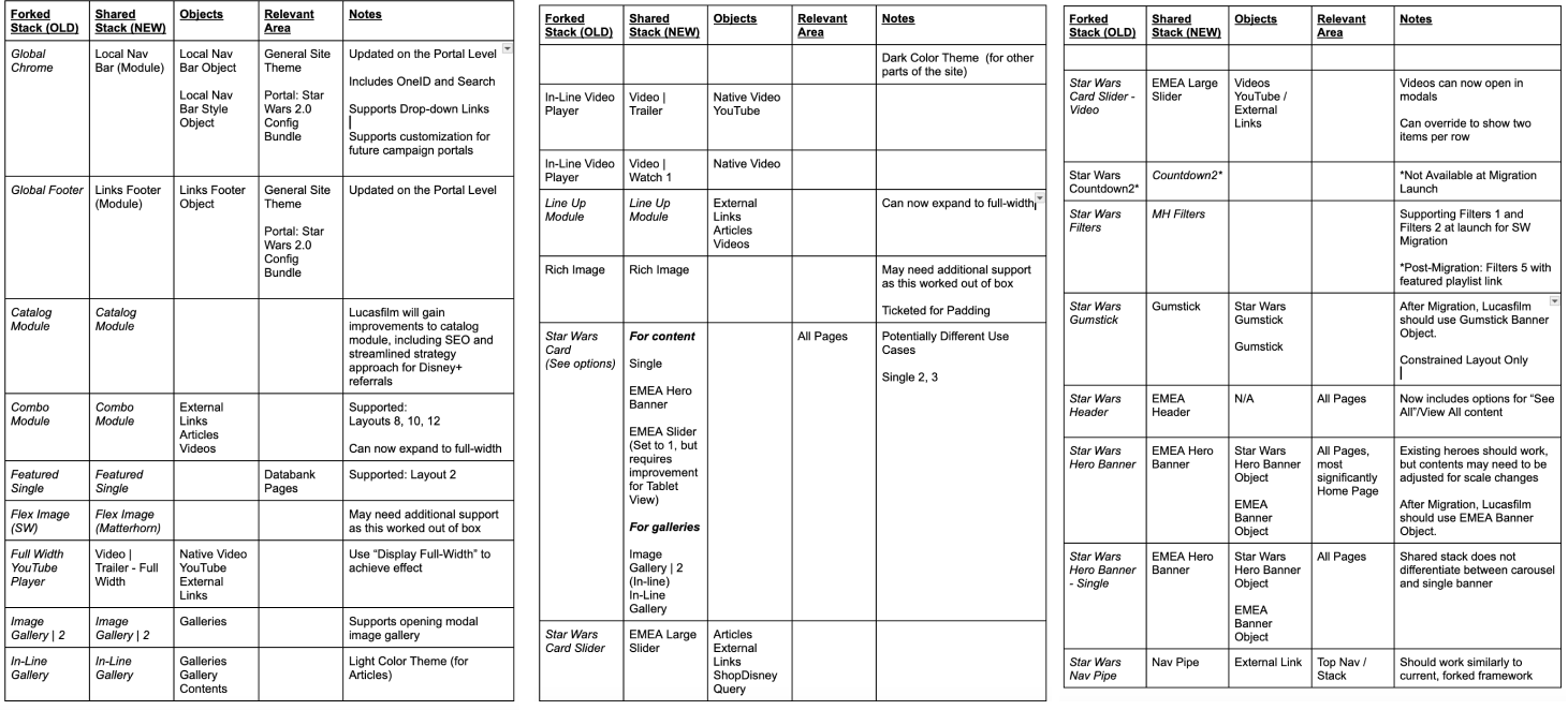
Modules Assessment
As part of StarWars.com Migration, we ported over modules from the Forked Star Wars stack that had existing wide applications throughout the current site and converted Lucasfilm over to existing modules on the Shared Stack. An initial audit was completed that offered approach and strategy to convert key sections, pages, and templates.
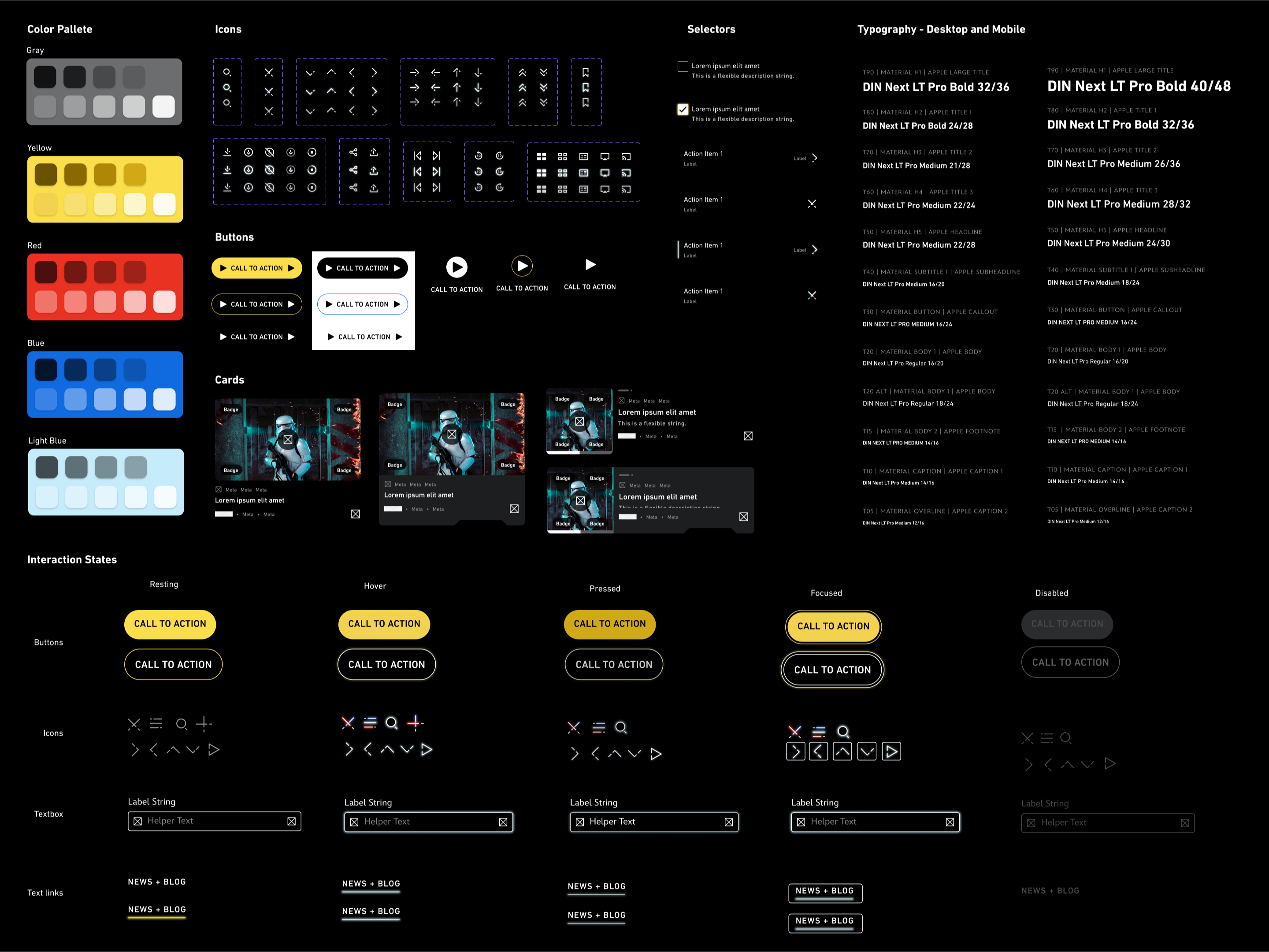
Improved Branding
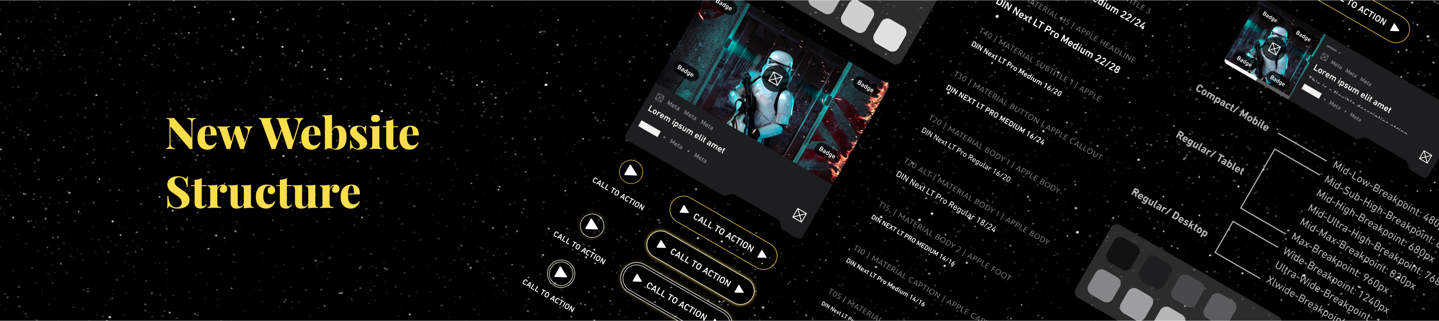
After an intensive audit of existing branding, we refreshed the visual identity by incorporating purposeful applications of color, glow, and typography. The team implemented a brand libraries and created component in Figma, housing the foundational style elements. The component creation also ensured consistency throughout projects, helped designers iterate faster and aided engineering in inspecting the exact styles.
Throughout this initiative, we found areas to add some brand delight. We added the line break rule to all the icons and horizontal rules. We also leveraged the “glow” elements to the icons for the hover state, along with adding a distinctive “notch” to the cards. To align with the Star Wars theme, we incorporated a lightsaber for the "close" icon and an orbit-inspired icon for pagination.
Given Star Wars’ is primarily in “dark mode,” we faced accessibility challenges. Consequently, we also created a system interaction logic that applies to dark interfaces. All the control components, such as buttons, badges, text fields etc. were also created in “light mode,” strictly for the article page.
Establishing Breakpoints
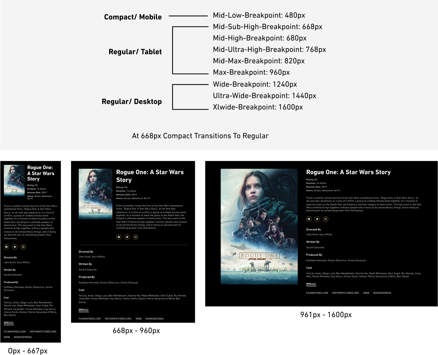
For responsive design, we established breakpoint transition points tailored to the most prevalent device sizes such as desktops, tablets, and mobiles. Knowing there are array of devices and and the technology continues to grow, we specifically considering the most widely used device dimensions. Google prioritizes mobile-first indexing, so a mobile-optimized site is crucial for SEO. Leveraging the capabilities of the Matterhorn CMS, we defined the transition points for layout adjustments. This documentation not only sped up the engineering process but also ensured a smoother alignment with design expectations.
Patterns
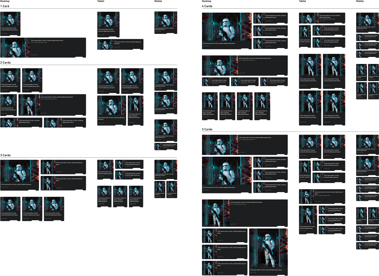
To offer the editorial team direction on content grouping, we introduced card grids. This method of organizing content is adaptable for use across various content pages. By adopting this modular approach, we expedited engineering implementations and ensured design consistency. I documented the card layout, up to a maximum of 5 cards, with any more having a "view more" call-to-action (CTA). Additionally, I illustrated of how the card layout would appear on tablet and mobile breakpoints.
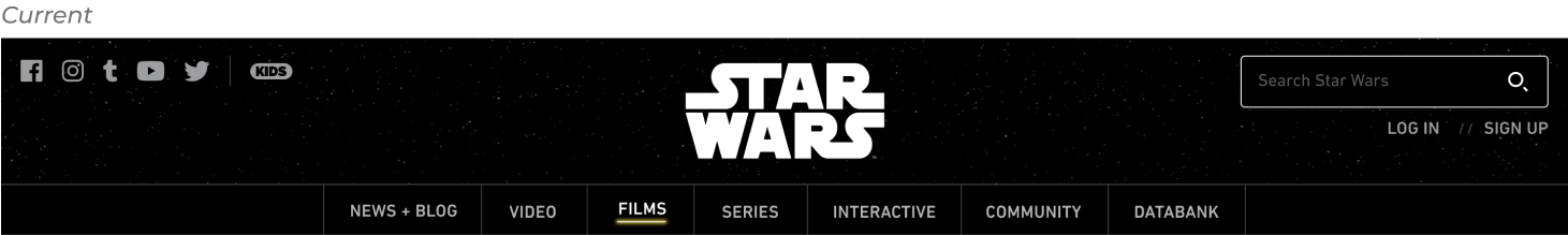
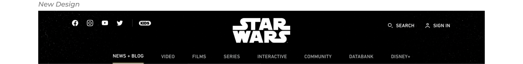
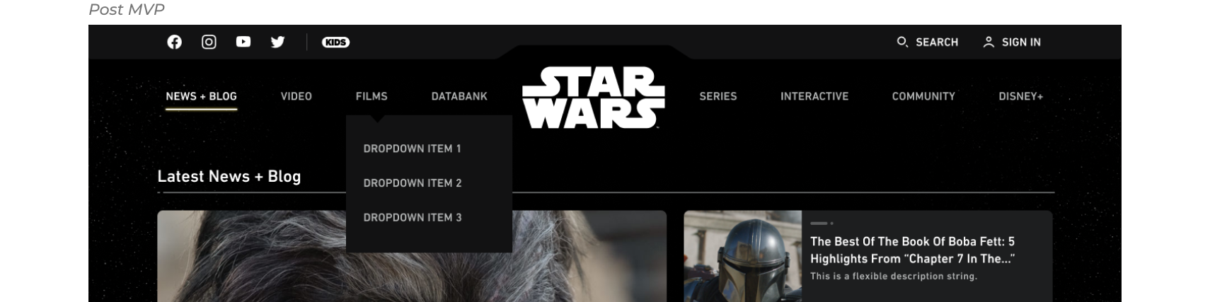
Top Nav + Footer
Top Nav
As part of the migration, the site's navigation was revamped with the Local Nav module, allowing for custom styling and introduced flexible features. For the migration, redesigning the IA of the nav was out of scope so we focused on visual enhancements by eliminating outdated elements and incorporating modern ones. Search was updated to a button that opened up to a text box field upon clicking to optimize space.
We also addressed login and logged-out states, streamlining the process. Due to time constraints, we opted for a design solution that posed less engineering effort. Post-MVP, we plan to integrate the Star Wars bar element into the design to further incorporate the brand delight for our users.
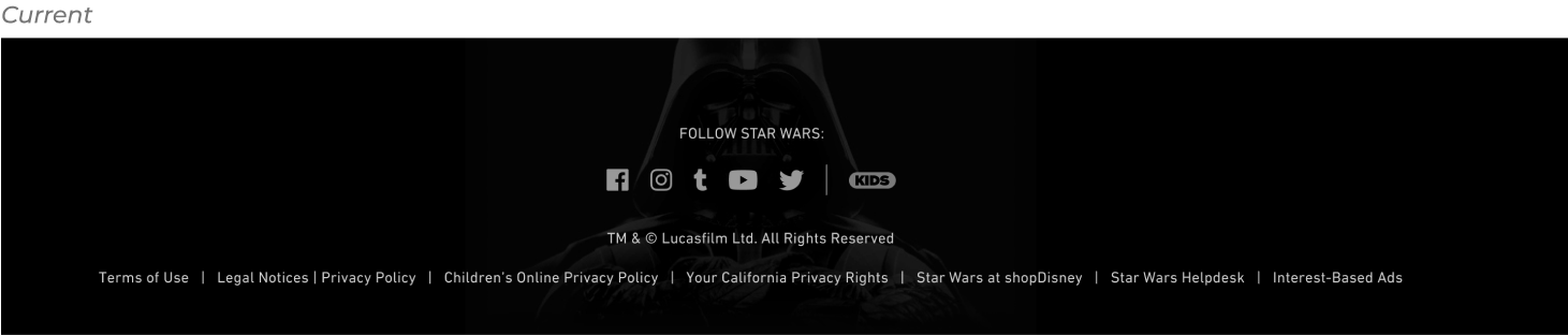
Footer
The footer remained fairly consistent and we updated the modules to further tie into the brand by removing the background image and adding the Star Wars notch as a design element, which is used through the website. Additionally, we took accessibility into account and added underline on the text links to be WCAG compliant.
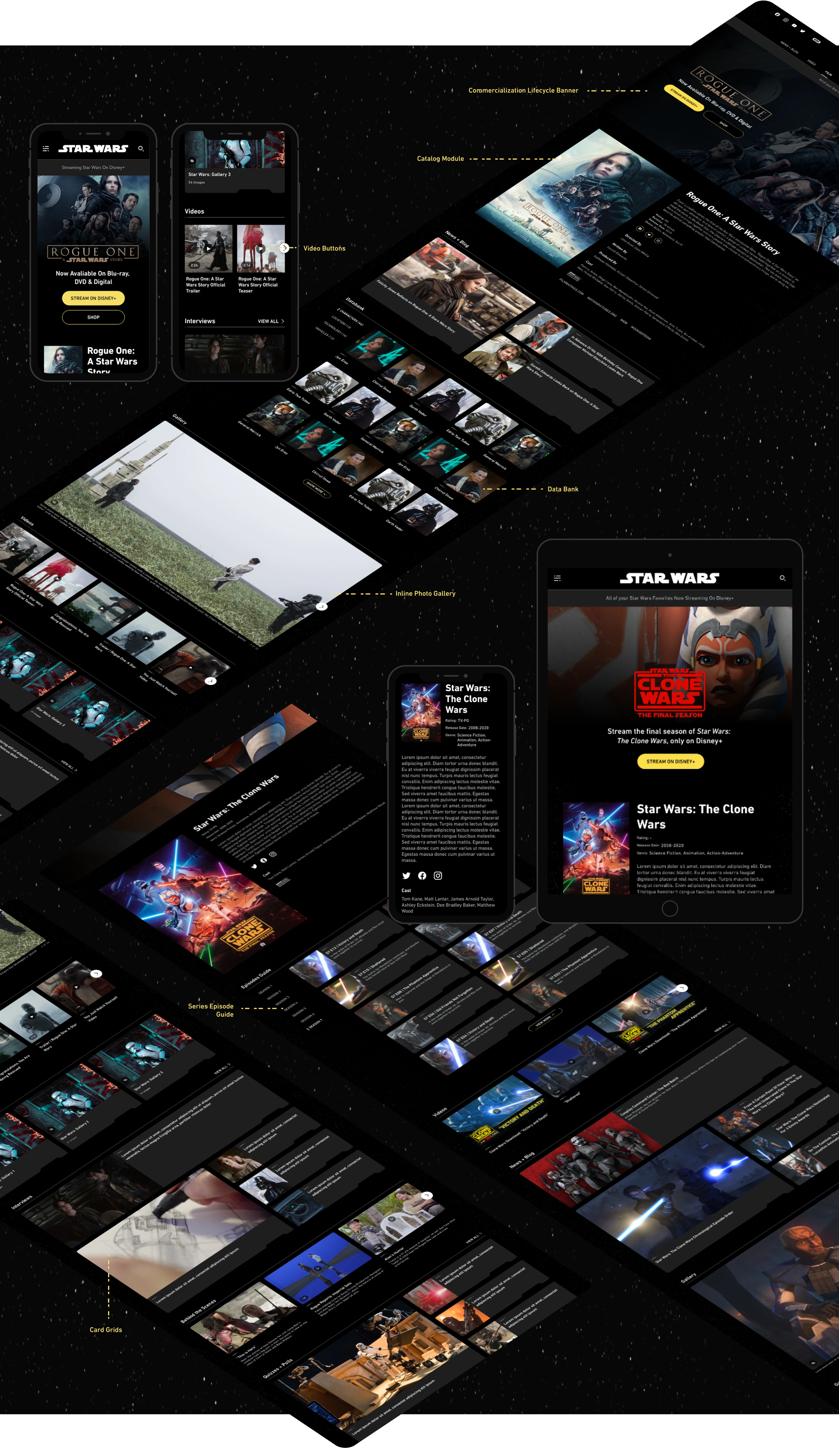
Films + Details Page
Films page
We enhanced and redesigned numerous elements on the film detail pages. The new film detail page features a hero image displayed as a full-bleed banner, providing support for each film throughout its commercialization lifecycle with clear CTAs. Furthermore, the Catalog module now showcases additional metadata for each film, including synopsis, ratings, seasons, etc., to enhance SEO.
To improve the user experience, we introduced an inline gallery, eliminating the need for users to click away to a new page to access galleries. We also added a “play” button on all videos thumbnail to easily help our users distinguish video content. Our main goal was to reconsider and optimize content grouping for seamless user navigation. To achieve this, we consolidated separate databank modules into a single module, allowing users to filter content and eliminating infinite scrolls. Lastly, we incorporated the card grid pattern to enhance content accessibility.
If the film is also releasing soon, the page will have a countdown module at the bottom that allows the user to directly buy the tickets for the movie.
Series page
The series detail page closely mirrors the film detail page, the only difference being there’s an episode guide with each season as a tabbed nav. This modules displays all the episodes based on the season selected.
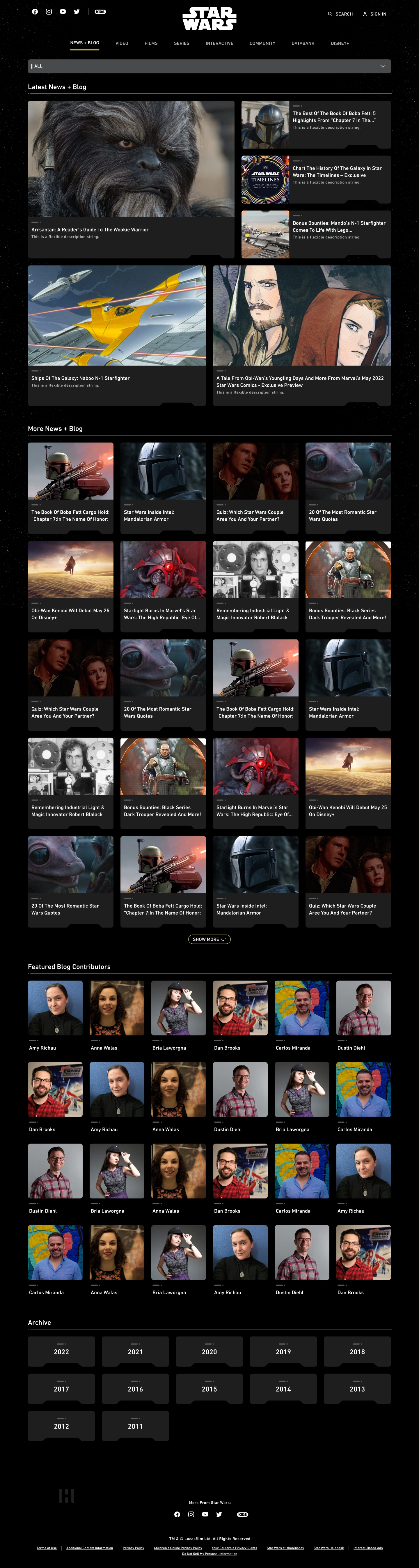
News Page
As part of the migration, we reimagine the “News + Blog” Page in the main navigation. This page serves to show our audience the latest and great news in of the Star Wars world as well as archives of all the articles, quizzes and other content from previous years.
The primary issue with the existing layout was the excessively long scroll, as all the news cards were stacked in a single column. This created a monotonous user experience and discouraged users from reaching the bottom of the page, where other important content like contributors and archives from previous years was located. Additionally, the filters on the right side of the page were not sticky, resulting in unused blank space after the users scrolled past them.
Our opportunity here was to envision a more efficient content navigation experience. We relocated the filtering system from the left side to the top, integrating it into a dropdown box to better optimize the space. Additionally, we introduced a "Latest News + Blogs" module first up, showcasing the most recent articles. Subsequently, all other articles were presented under "More News + Blogs" in a 4-up grid to provide a show case more content. After five rows of articles, users could opt to view more by clicking the "show more" button.
Beneath this section, we incorporated the contributors' pages, followed by an improved card layout for the year archives.
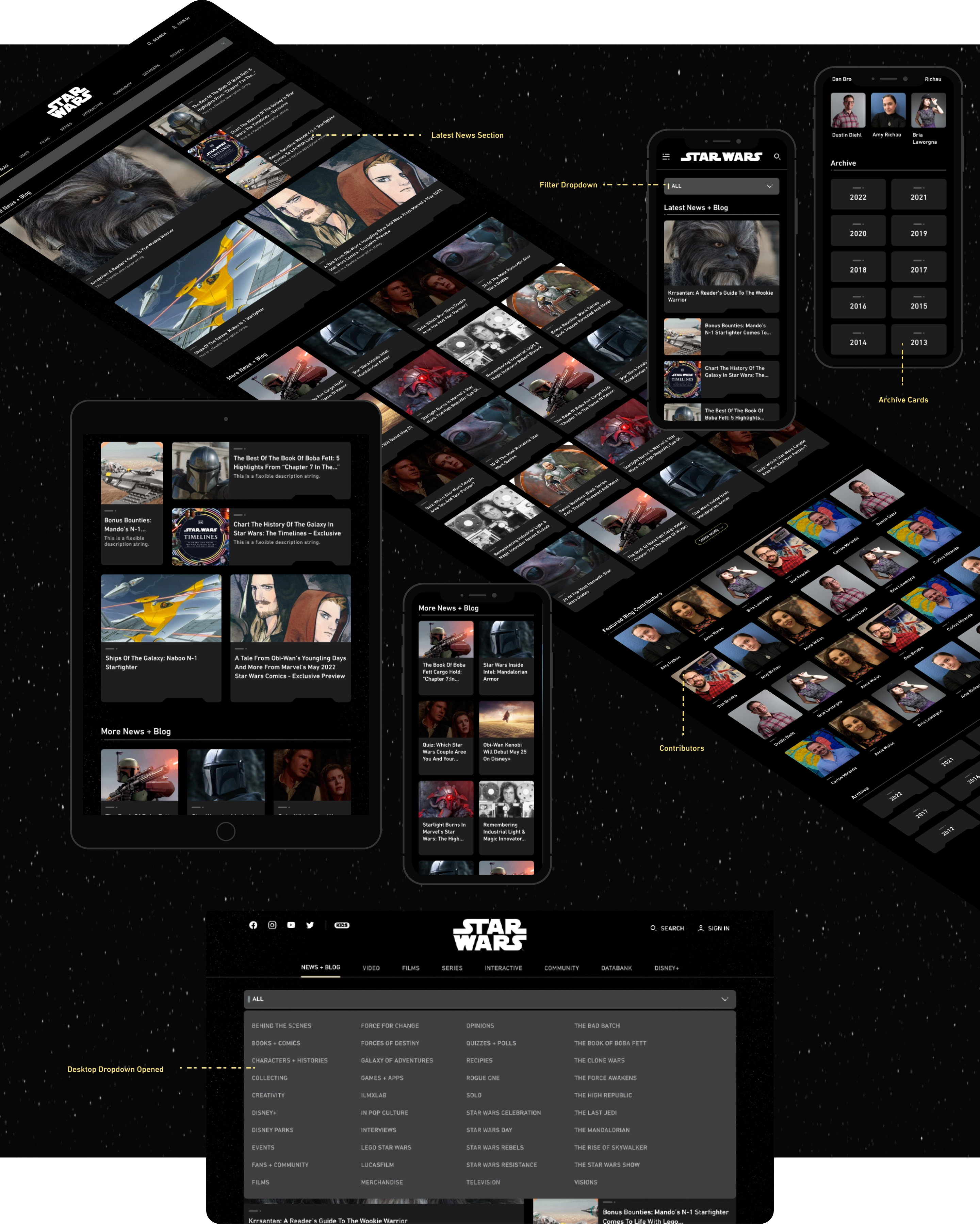
Contributor Page
The contributor page provides detailed insights into the authors of all the Star Wars content. The redesigned contributor page uses three column grid for the bio section, showcasing all articles attributed to that author. We worked through few options that showcases different variations such as full bio + full content, less bio + less content, no bio + content, partial bio and content only (no bio). This iterative approach allowed us to consider and refine multiple layouts to enhance the overall presentation by each author’s case
Article Template
The article page underwent updates to align with the Prism, Disney internal design system, as part of a broader redesign initiative during the migration process. Initially, we suggested incorporating a darker background for the article, but received push back from business. Consequently, we opted to maintain a light gray background. The new template introduces several enhancements which previously were absent in the CMS platform, including Primary and Secondary Tags, Social Sharing, and List Orderings, among others.
Lessons + Takeaways
- Learn a new CMS platform, Matterhorn, and demonstrated adaptability by being creative working within its constraints.
- Developed skills in collaborating with cross-functional partners during a fast-paced project with legal considerations.
- Successfully incorporated the Prism Design System into the brand, aligning design elements with established guidelines and standards.
View Other Case Studies