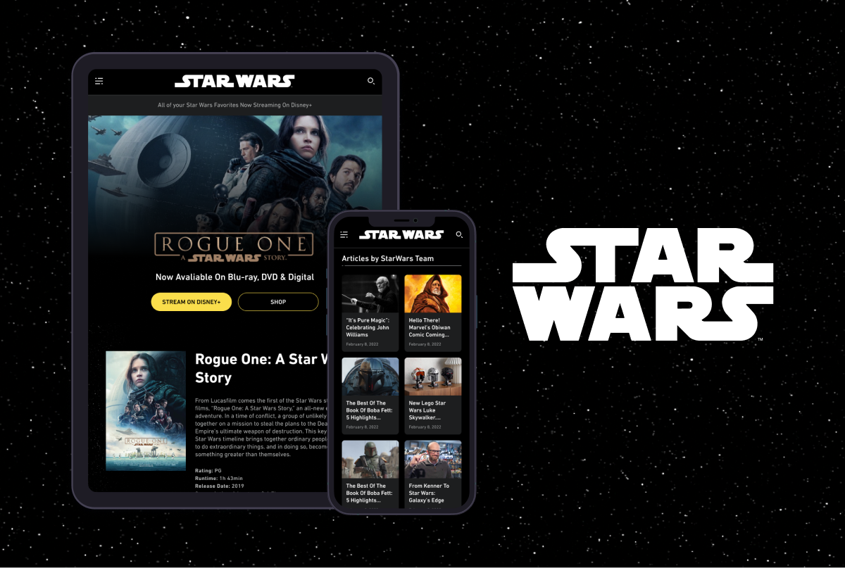
ROLE
Product Designer
TEAM
3 Product Designers, Project Manager and Developers
LAUNCH DATE
Home Tab - Nov 2023
Watch Tab - May 2024
OVERVIEW
The Home Screen and Watch Screen of the current ABC News and 8 OTV (ABC Owned Television Stations) apps required redesigns based on user testing research. These two tabs are among the five primary navigation tabs and receive significant traffic.
OPPORTUNITY
The main two navigation tab redesign aimed to improve content organization and navigation to address user concerns and enhance the overall experience. By introducing card variations for easier content consumption and clearer topic navigation, there is an opportunity to boost user engagement, meet expectations, and retain loyal ABC News readers.
MY ROLE
As the brand advocate and design lead for the Platform Vertical team, I contributed by working on new features to improve the app and enhancing existing features, specifically the Lead Card, Article + Video Playlist, Headline Stacks, Breaking Banner and the Watch Page. Additionally, I translated all the features from light mode to dark mode using a specific color logic and accounting accessibility. I proposed ideas outside the project scope and secured stakeholder approval by showcasing their value. Working closely with research team, I assisted in conducting a follow-up user study to test the Homepage Redesign 2.0 before its launch and rapidly iterated on the changes based on the feedback.
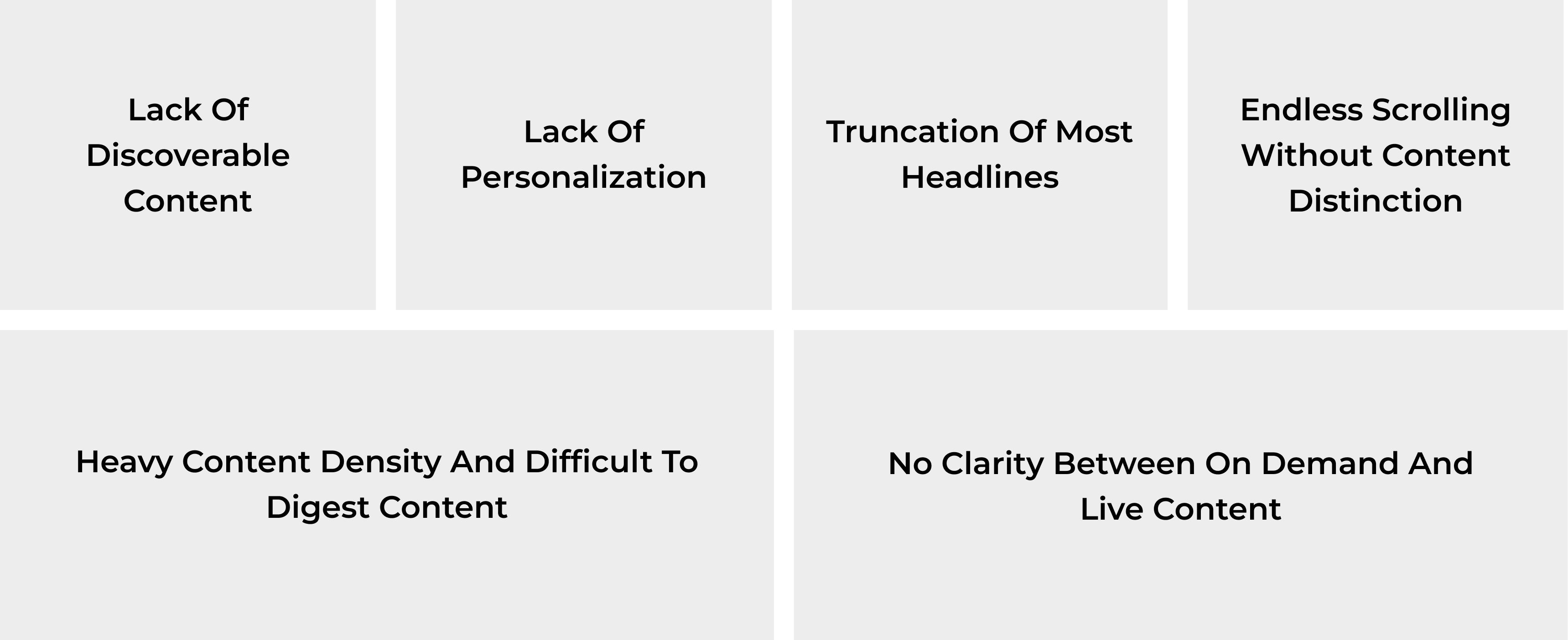
Problem
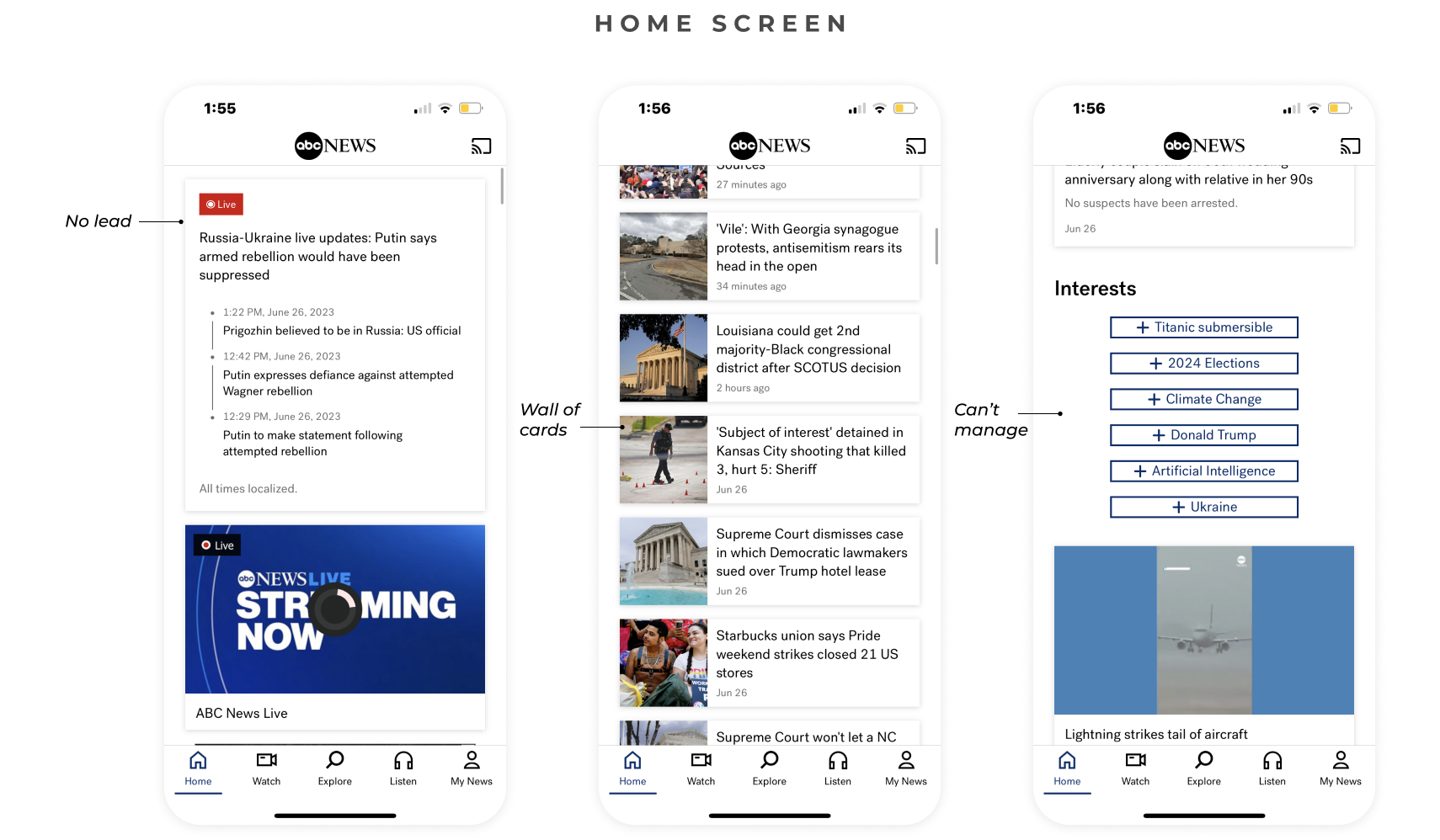
Home Screen: The main challenge was that the home feed appeared as a wall of cards with no clear distinction between content types. Users frequently mentioned that image thumbnails were too small, text sizes were inadequate, and most headlines were truncated. Users struggled to quickly identify relevant headlines, leading to frustration and inefficiency. It presented too much information at once, overwhelming users and making it difficult to focus on key stories.
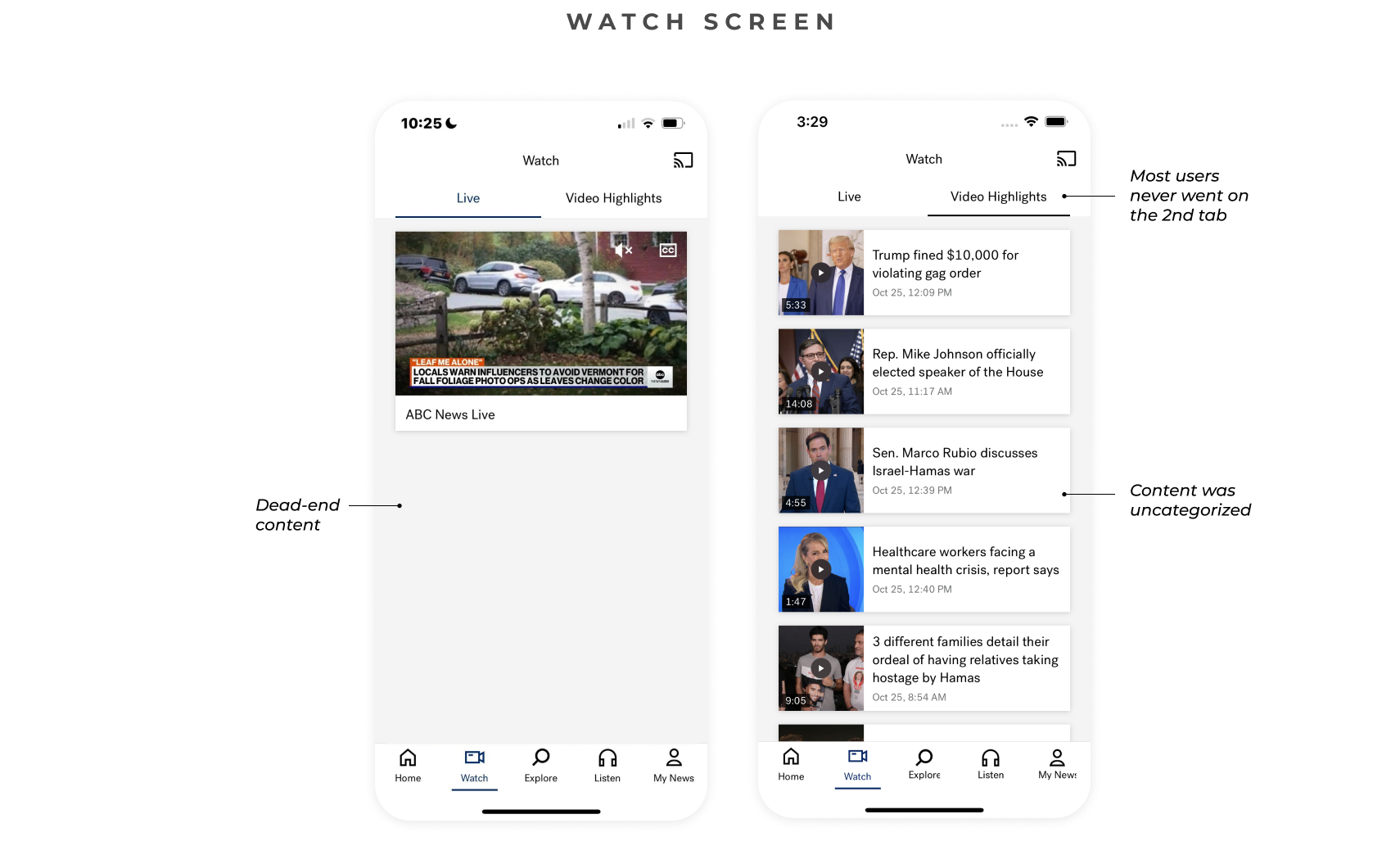
Watch screen: There was a noticeable lack of visible curated content and live streams. Users were also confused about the difference between VOD and live content and the experience was not intuitive.
Solutions
Our solution was to introduce different card types to enhance content consumption and improve topic visibility. We organized content by topic with clearly labeled sections for easier navigation, emphasizing reduced vertical scrolling and more intentional storytelling.
For the watch tab, we consolidated content into a single scrollable section that distinctly differentiates between LIVE and on-demand content, while establishing a clear and organized hierarchy of information with labelled sections.

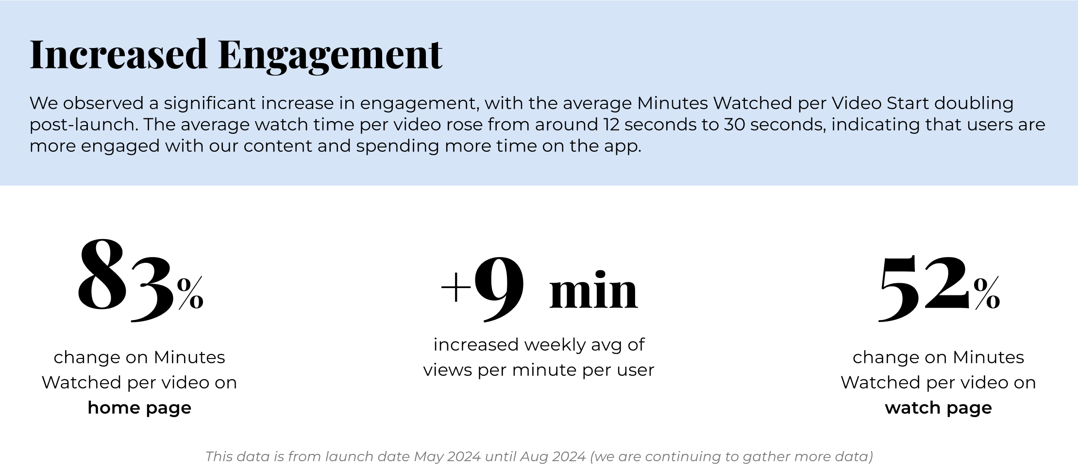
Analytics
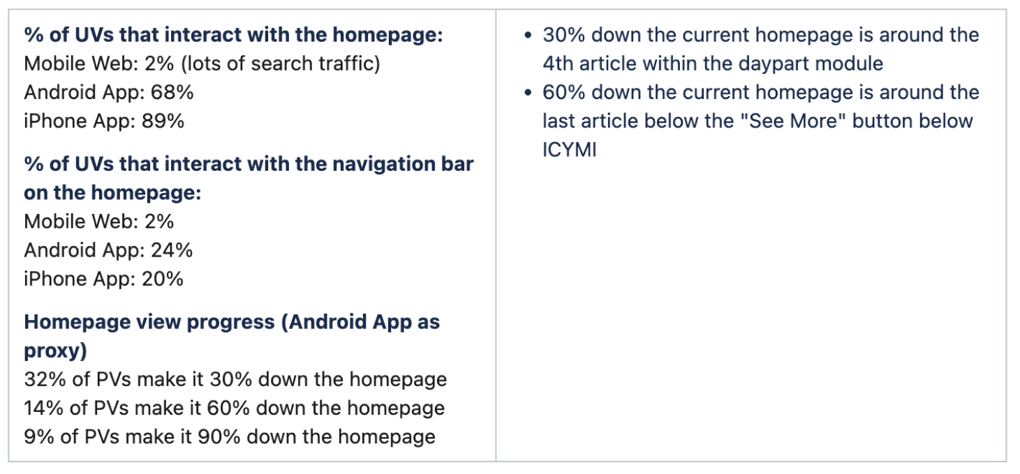
Partnered with the research team to pull user data on the current home and watch screens. Audited existing cards/modules on current home screen and mobile web layout
- Users spent an average of 1:33 Android/1:22 iPhone minutes on the homepage vs. 2:13/1:41 minutes on other pages where they spend more time in the content of the page.
- A weighted average of 27% of home page views were single visits, showing that these users only interacted with the homepage, not delving deeper into the site.
- Of the 10% users who click on the Watch Screen less than 2% are clicking on video highlights
- On a given day, ~100 videos are uploaded and only 20 are shown in the app under Video Highlights
Current Gaps
Competitive Analysis
A key takeaway during the competitive analysis was competitor apps typically lead with a prominently featured top story on the first screen. Most apps organize their home screens by sections, using different layouts to enhance the section experience. Article cards vary in design, with larger headlines displayed in full-width cards and smaller stories in condensed rows. Some apps also utilize horizontal scrolls for content galleries and sub navigation for top headlines or verticals, allowing users to easily navigate between topics.
Design
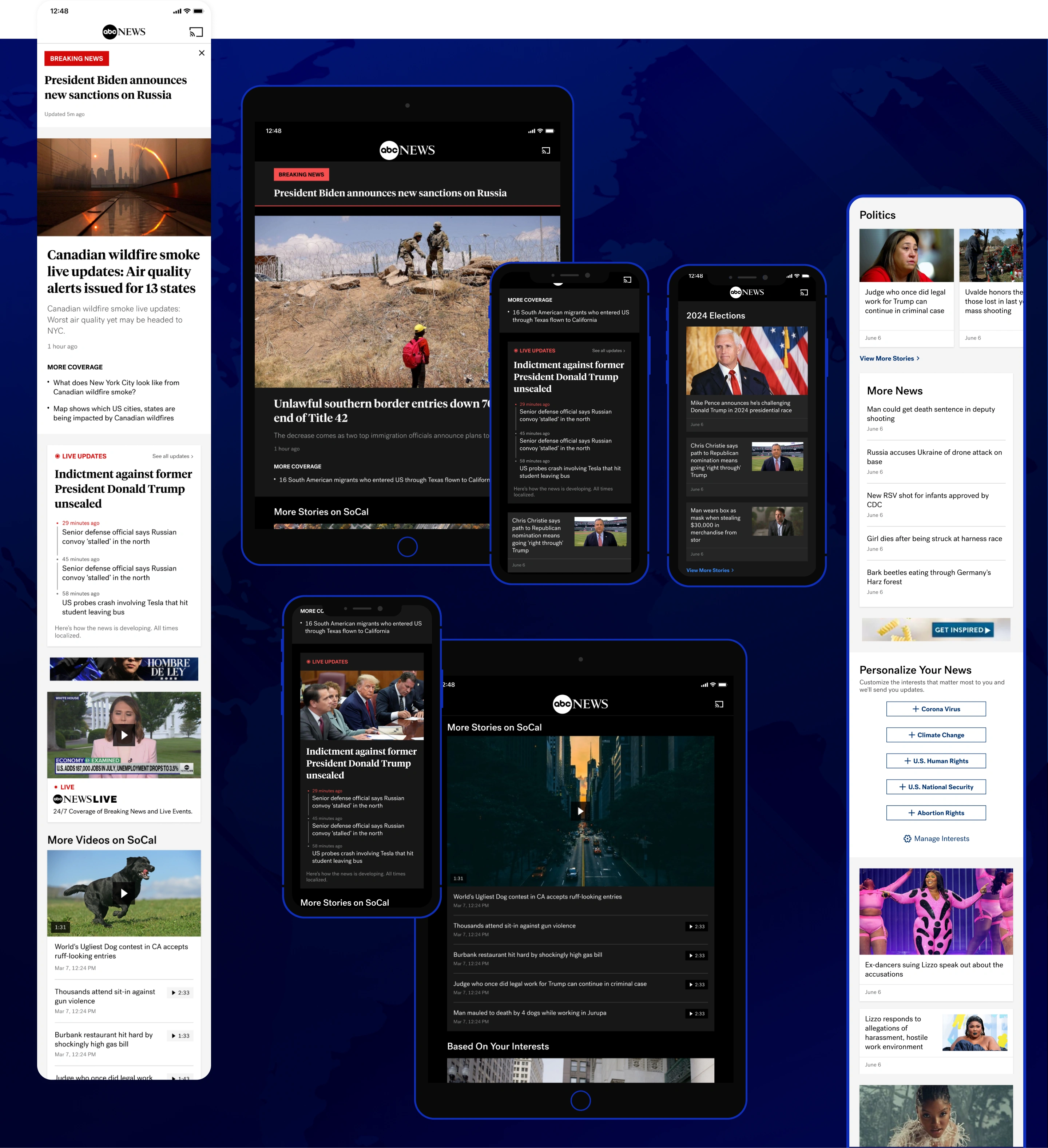
As part of the redesign we updated all inline cards app wide and incorporated 7 features, some new and other enhancements to existing.
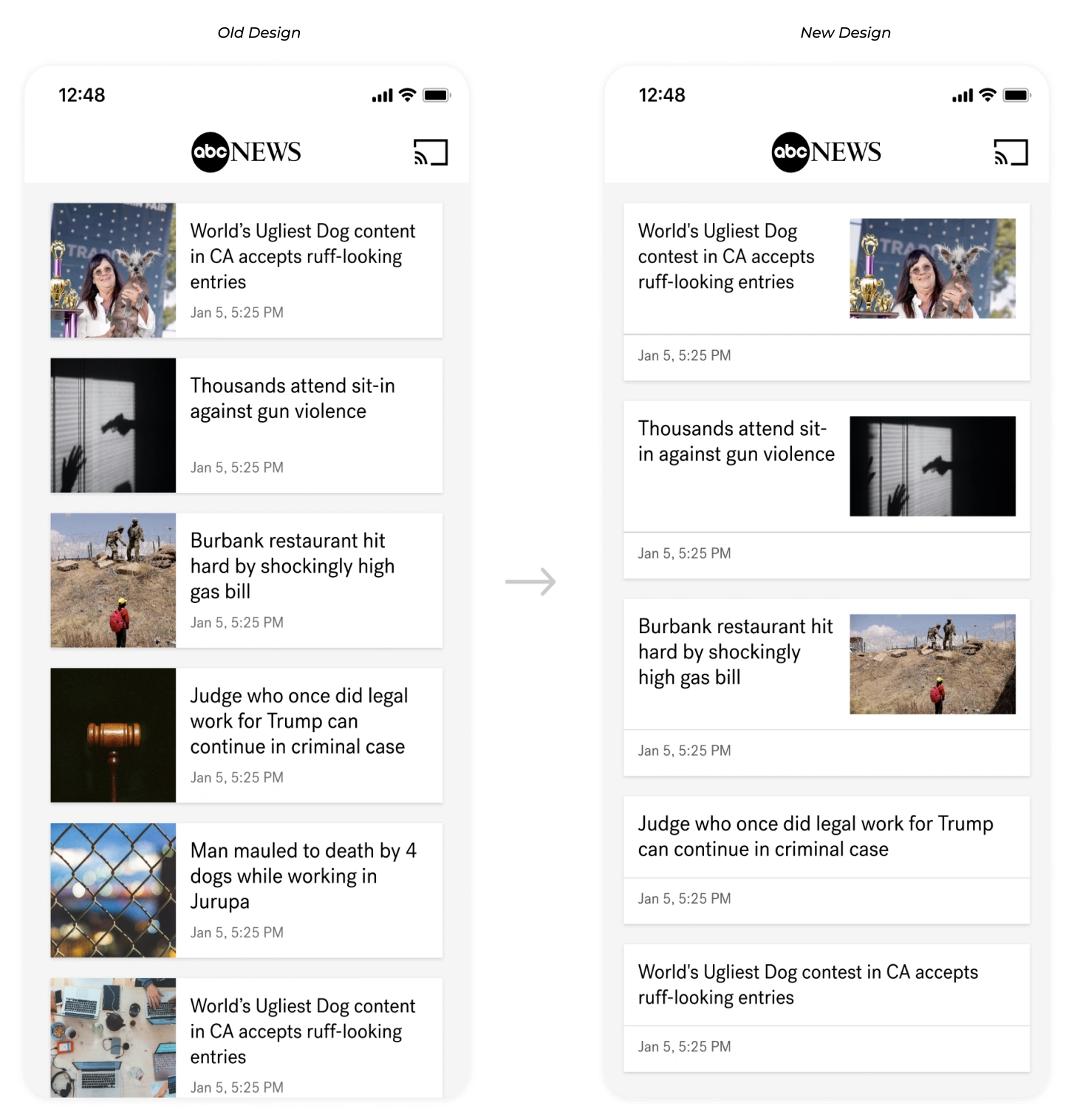
One of the key updates were to the existing inline cards. The new inline card design places the thumbnail on the right to allow for longer headlines moving the meta data below the divider so there’s more room for just headlines. It also introduces a divider line to clearly separate card elements like metadata and better consumption of the card information. Lastly, it improves readability by aligning content to follow a left-to-right reading order and maintain balance.
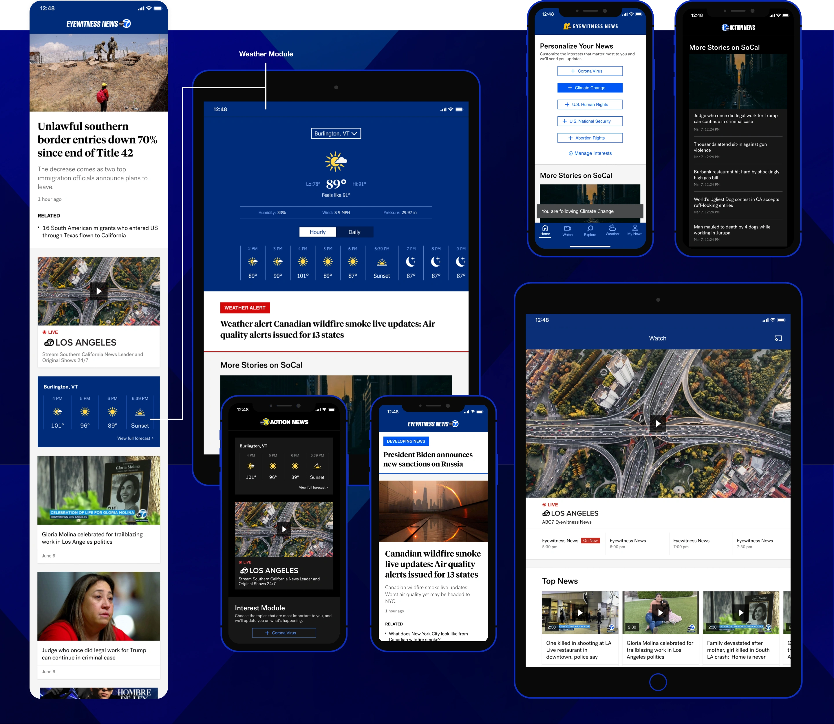
Home Screen Features
Overview
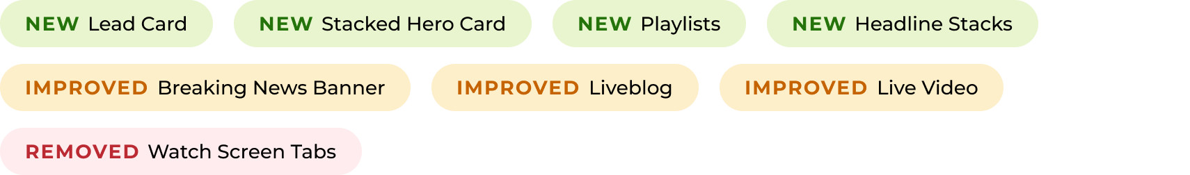
1 | Lead card (new)
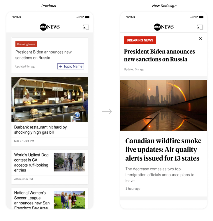
Since there was no hero card, we introduced a lead card for top news, accompanied by a collection of related coverage. 2-3 stories are prominently displayed above the fold for immediate visibility. The background color has been changed to a different gray, with adjusted drop shadows to make the cards stand out, giving the section a distinct and editorial feel.
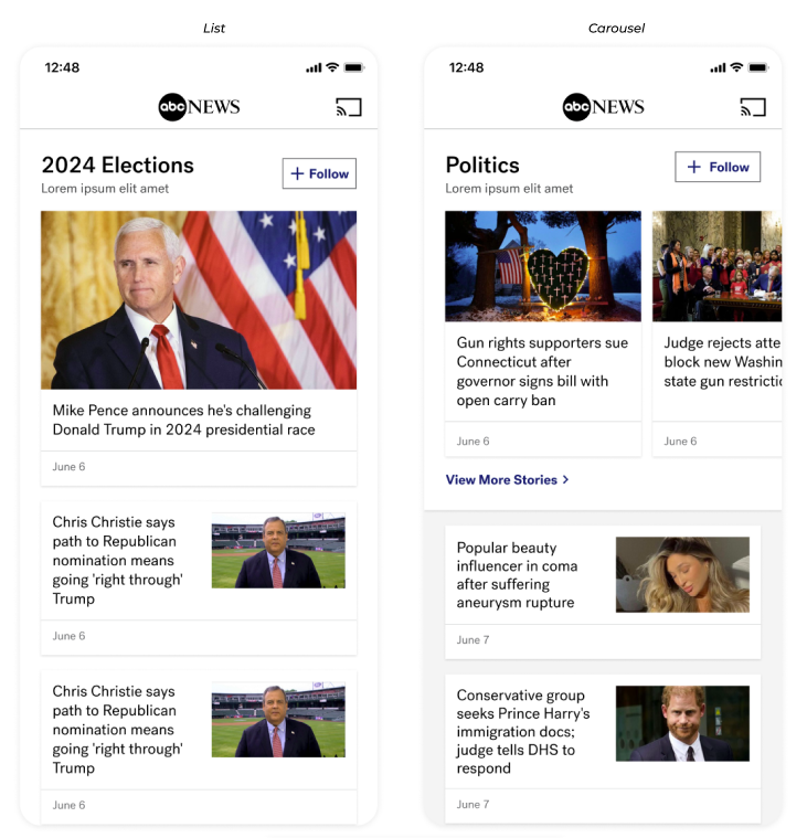
2 | Stacked hero (new)
We introduced stacked hero pattern which are combination of stacked and inline cards. These are reusable patterns to increase ease of skimming, improve the follow-topic experience, and guide users to collection pages. It can be a list or carousel with a CTA to go to the collection page of all stories.
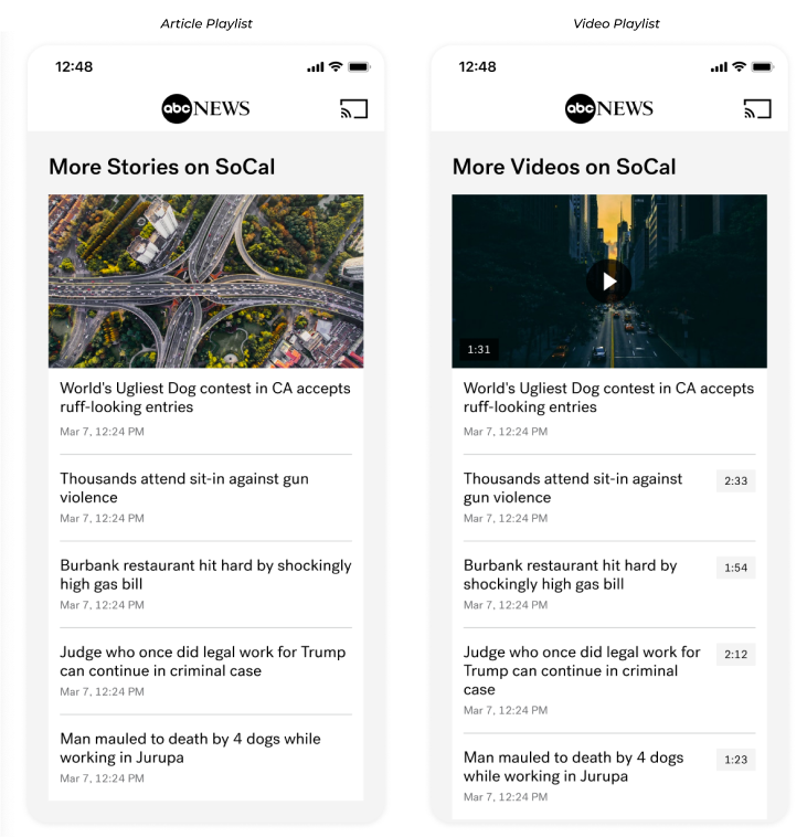
3 | Article + Video Playlist (new)
Playlists are card collections that use simple cards, which can be paired with stacked cards to break up the content. This feature allows users to quickly find related stories in one place without excessive scrolling, enabling more content to be displayed in a smaller vertical space. Similar card collections are used by ESPN and they have some of the highest click rates. It is a reusable pattern and both share same elements besides video playlist having the timestamp. Since increasing video viewership is a key business goal, this feature will help us achieve that objective.
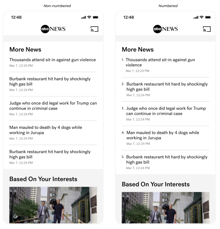
4 | Headline stacks (new)
The next feature is headline stacks, which is similar to article and video playlists but do not include a preview of the first article. These are essentially collections of condensed cards that engage users by presenting a variety of unrelated stories at once, allowing more content to be displayed in a smaller vertical space. This pattern is also reusable. In terms of design, editorial teams can number the stacks to rank the top 5 news stories if desired. Additionally, metadata has been added to enhance the legibility of each article which was an editorial feedback.
5 | Breaking news banner (improved)
This feature was an enhancement to an existing breaking news banner. The new design emphasizes the article title without adding clutter, signaling the importance of an event and encouraging users to click on the banner to read more. Additionally, they are have the option to close the banner if they choose to.
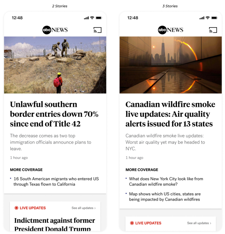
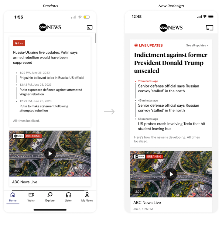
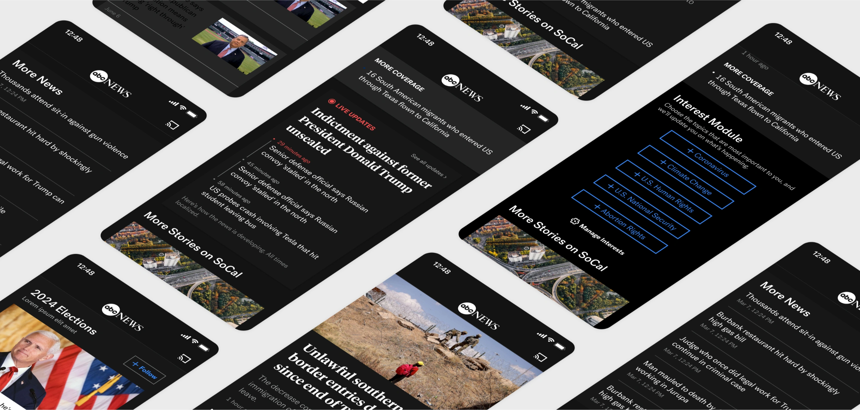
6 | ABC News Liveblog (improved)
The visual enhancements include an update to the current feature, addressing user feedback that the previous design made it difficult to discern the hierarchy of information, especially when two live blogs were placed side by side. To improve this, we updated the headline to Tiempos for more emphasis, aligned the “live update” badge with the web version for consistent branding, and added a clear call to action with a "See all updates" button, guiding users to the Live Blog Article.
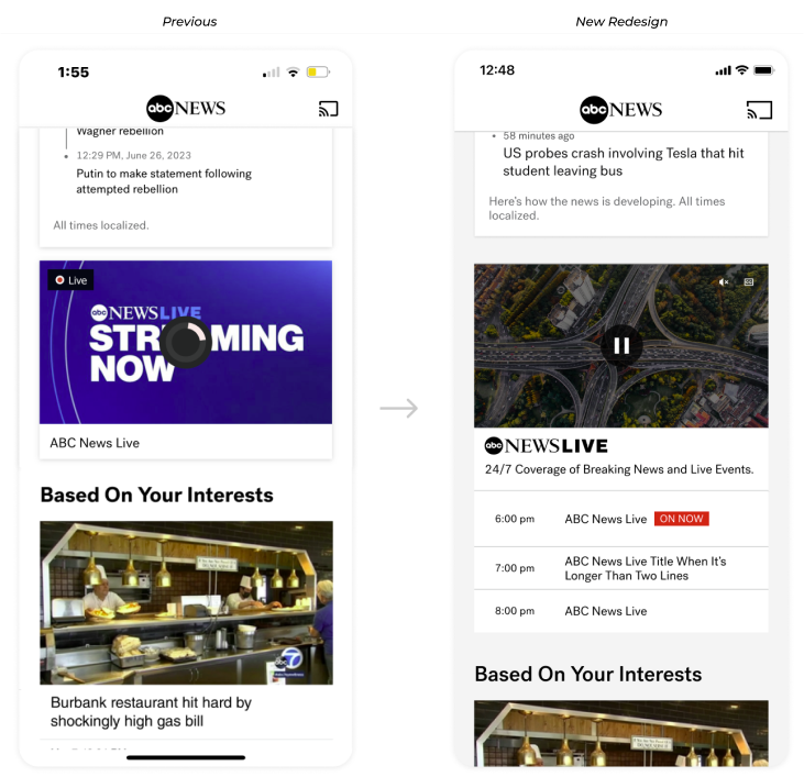
7 | ABC News Live Video (improved)
The current ABCN live card used the same design as other cards, lacking distinction. To clearly indicate that it’s a live stream, we added the ABCN Live logo and added the “On Now” label. We also introduced Closed Captioning and Mute controls that appear when users interact with the video player, ensuring easy access even on the home screen. We added Electronic Program Guide (EPG) directly on the card to further differentiate it and entice users by showcasing upcoming content.
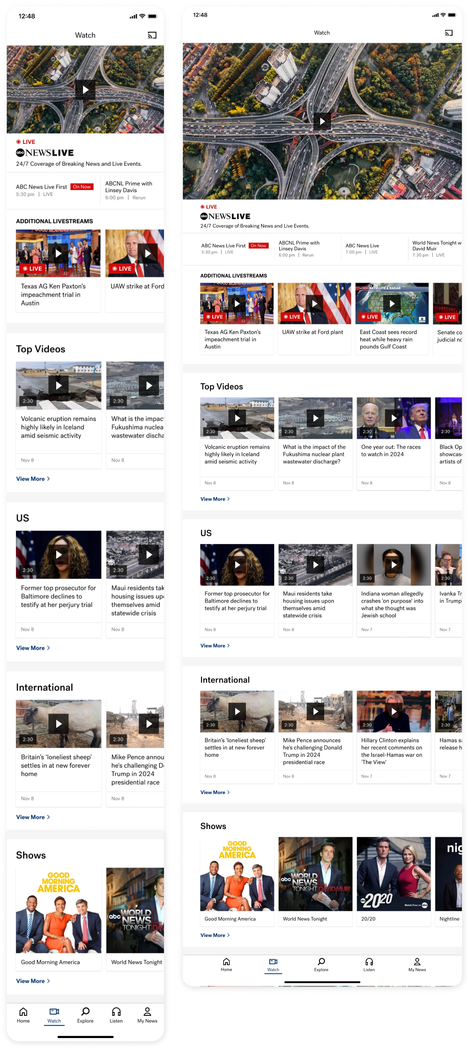
Watch Screen
The final Watch tab for ABC News: The Live Stream is prominently highlighted, followed by a horizontally swipe-able, condensed EPG, allowing more content to be displayed below. This structure mirrors the ABCN Website, ensuring consistency between the app and web.
Next, there's an additional live stream carousel, which may be programmed depending on content availability and timing. After that, we transition to VOD content, starting with the Top Videos carousel curated by the editorial team. This carousel displays a maximum of five videos, with a "view more" CTA linking to the collection page for more content. Following this, there are four topical video carousels, each with a similar structure—up to five videos with a "view more" option. Lastly, we have the shows carousel. the tab features our shows, highlighting additional content users can watch, with a link to the Shows collection page
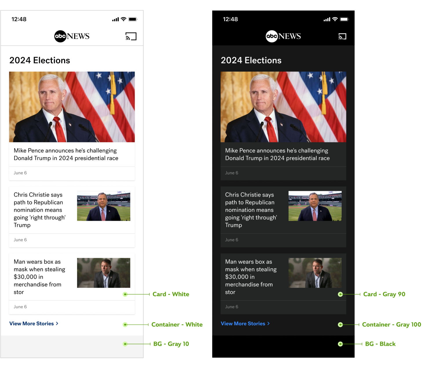
Darkmode
In compliance with accessibility standards, I carefully applied a color logic when translating designs from light to dark mode. This logic ensured all features were accessible, including a key update that changed the app background from white to Gray 10 to enhance the features. To avoid common pitfalls of dark mode, such as reduced legibility and visual fatigue, I prioritized color contrast and readability, balancing aesthetic needs with usability. Though the transition was complex and challenging, it ultimately improved the user experience for both light and dark modes.
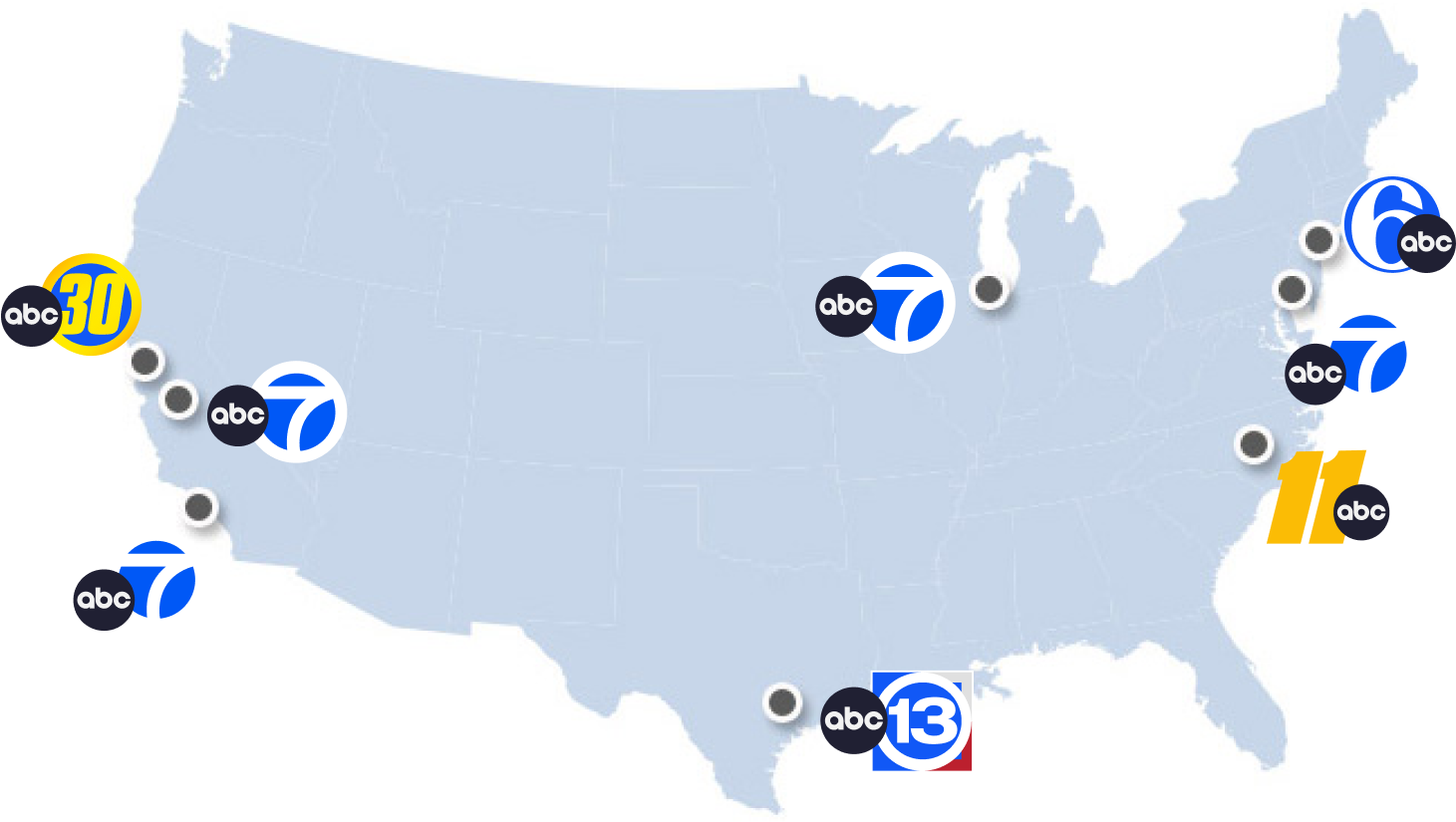
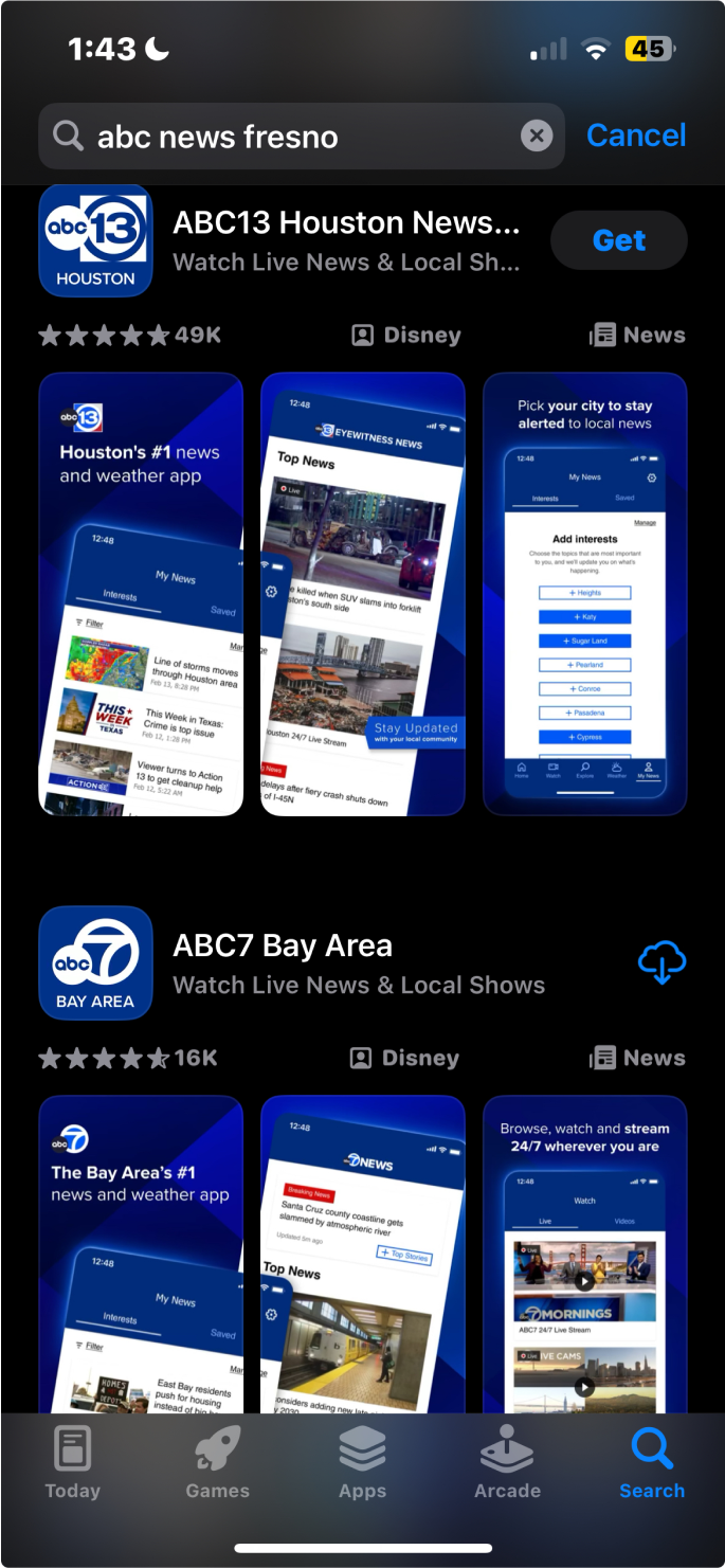
OTV Apps
OTV refers to ABC News’s eight owned television stations located in New York, Los Angeles, Chicago, Philadelphia, San Francisco, Houston, Raleigh, and Fresno. The redesign also applied to all eight OTV apps, allowing the same features to be added across the board with updated branding. In addition, local-specific features such as a weather module were incorporated to enhance the local user experience.
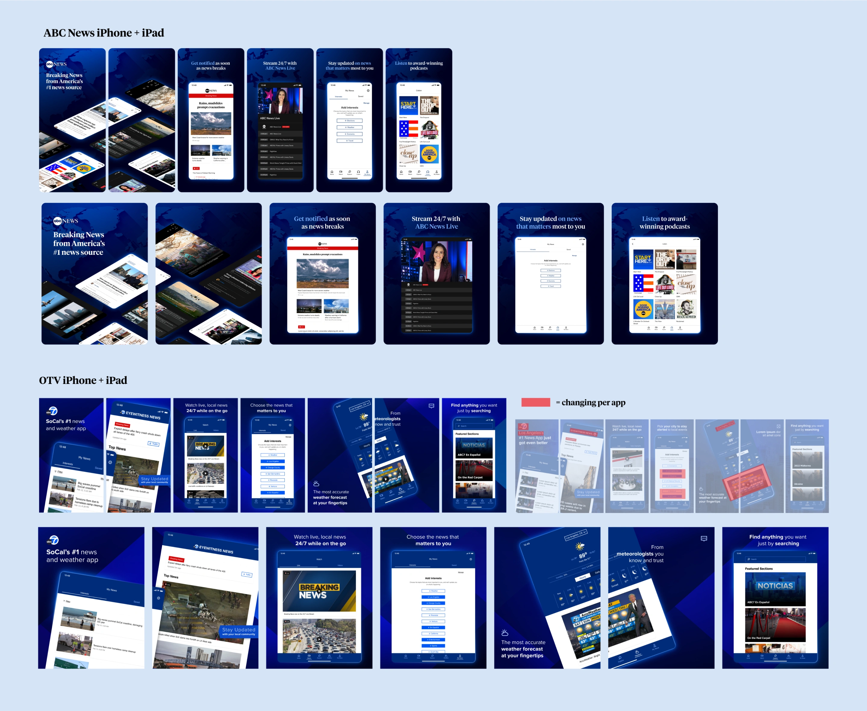
App Store Screens
I had the opportunity to design the app store preview screens for all nine apps on iOS app store and android play store. I aimed for a modern and appealing visuals, as first impressions are key for users downloading apps. I showcased our new features prominently, focusing on impactful imagery, keywords, and typography to highlight each feature effectively. The creative process involved creating variations for different devices, ensuring the iPhone previews matched the structure most accurately for users on iPhone 5.5, 6.5, and iPad. We also tailored designs for iOS and Android systems, aligning them with their respective operating guidelines. ABCN app screens were done in collaboration with another designer.

Lessons + Takeaways
- Learned to communicate in technical terms, allowing me to clearly explain solutions and understand engineering perspectives.
- Adapted to high-stakes projects with capital budgets in a fast-changing requirement environment.
- Worked within the constraints of the FITT tool, managing direct dependencies with the app.
- Collaborated with multiple designers on the same project, maintaining reliability as a team player while taking ownership of my individual tasks.
- Played a key role in collaborating with cross-functional teams, advocating strongly for my team.
View Other Case Studies