ROLE
Lead Product Designer
TEAM
Product Designer, Product Manager and Developer
LAUNCH DATE
July 2023
OVERVIEW
Widgets play a key role in boosting user interaction by delivering content directly to their home feeds. It provides users with quick access to relevant and glanceable information from their favorite apps directly on the home screen. Users can customize their home screens by choosing the size and placement of widgets, tailoring their experience to prioritize the information that matters most to them.
OPPORTUNITY
Create iOS home and lock screen widgets for National Geographic to integrate visually captivating content right on the home screen, encouraging Nat Geo app launch. Clicking on the content seamlessly directs them into the app, allowing them to explore articles or photos.
Primary Goal
Our goal is to enhance app usage and engagement, ultimately drive up monthly logins and subscriber growth. We also wanted users to be able to customize their home screen by adding widgets in various sizes and content type.

Market Research
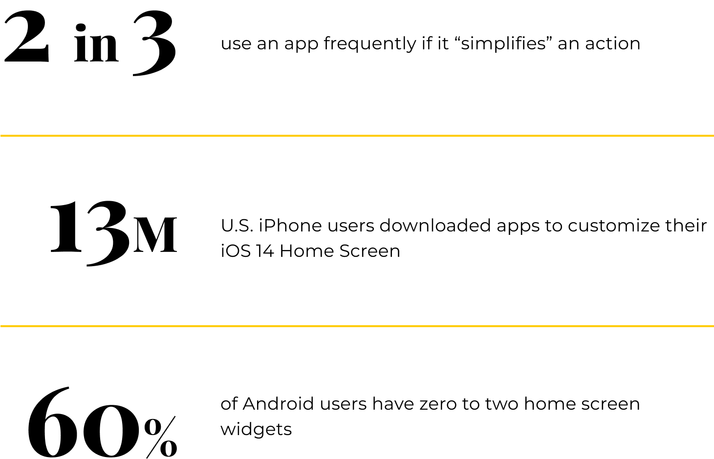
Previously, widget growth relied heavily on third-party support. Applications with a decorative focus, such as Widgetsmith and Brass, generated 1.8 million downloads. However, now companies are integrating widgets directly into their own apps. Research shows widgets increase engagement, personalization and utility.
Strategy
product considerations
Widgets can be placed on either the home or lock screen. Create two types of widgets:
To promote more content on the app, the articles widget will display 1-4 articles along with their lead image.

Photos are very important to users as to the Nat Geo brand. It’s also a great way to “decorate” your phone screen. Hence, the gallery widgets will come in 3 sizes (S, L, XL) and cycle through photos from the Photo of the Day section.
Understanding content
The gallery widget will be populated with content from the existing "Photo of the Day" feature in the app. On average, around five pieces of content are published daily for articles. If any content was created after 4-5 pm the previous day, a batch of articles is published in the morning; otherwise, content is published as it is created.
Competitive Analysis
Current Landscape
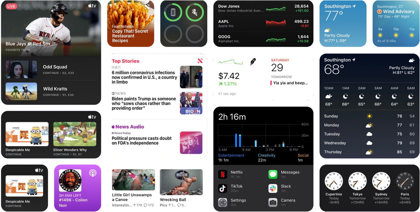
In general, the desire for widgets ranges from utility to customization. For example, Flighty widget incorporates features such as a trip countdown, live flight status, and an in-flight progress bar that functions offline. When it comes to customization, Widgetsmith continues to be one of the most popular widget customization apps with its updated editing tools & URL triggers.
Content variation
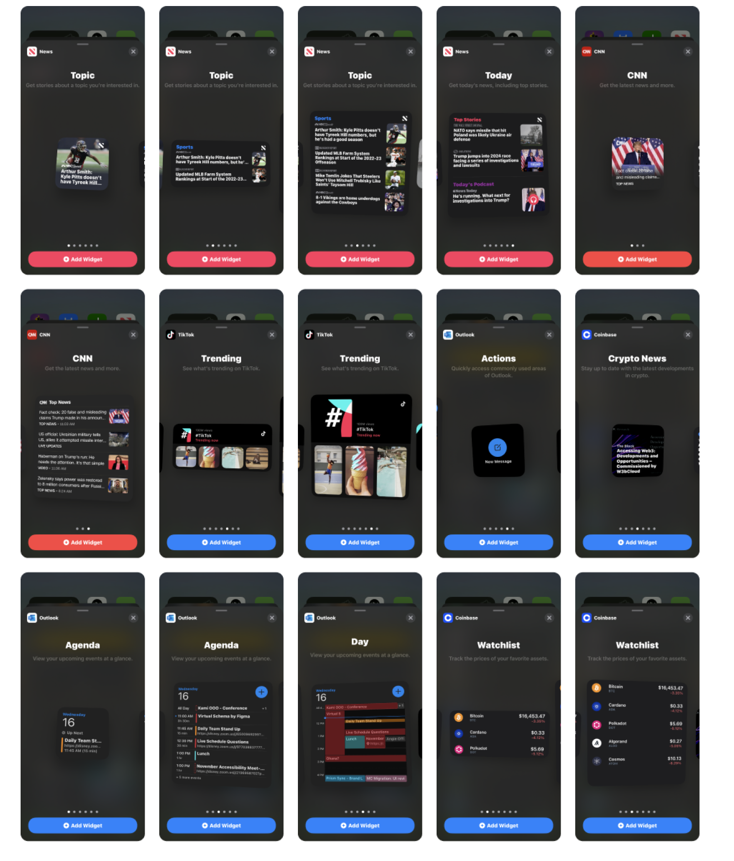
In the course of our competitive research, we determined that the most effective widgets feature diverse content and provide users with the option to choose from various elements. We analyzed the usefulness of different content aspects, including the placement of metadata, variations in image sizing, and the length of titles (character counts). Additionally, we conducted research on the importance of logos in widgets or if the widget name alone is sufficient.
Technical Factors
Apple Widgets documentation was taken into consideration every step of the process. Few key points included: small widget size only have one touch target, widgets cannot go over 30 MB of memory, able to send out service requests once every 15 mins at minimum and lastly, apple monitors the Widget processes and will shut it down if it is taking too much energy.
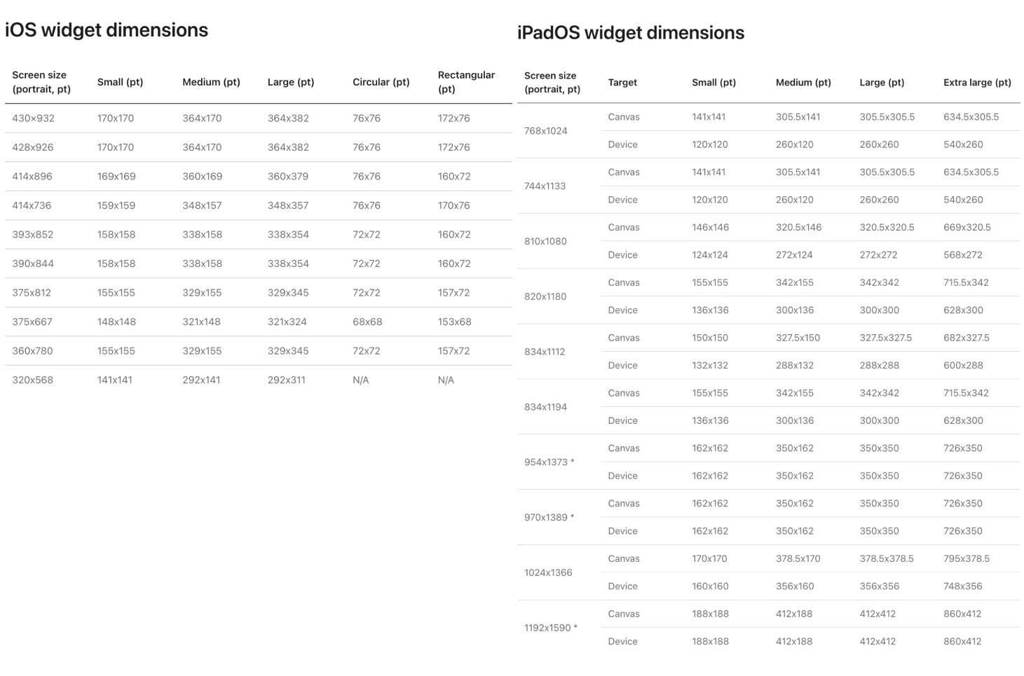
Key Insights
After conducting thorough research and competitive analysis, while keeping the business goals in mind, the primary takeaways were:
- Choose a single, simple ideas that relate to Nat Geo’s main purpose for the widget design to ensure relevance
- Tailor the content and functionality in each widget size to focus on the primary purpose, avoiding unnecessary expansion of content when transitioning to larger sizes.
- Provide value by offering the widget in multiple sizes, emphasizing quick access to meaningful content, and opportunities for surprise and delight, such as unique visual treatments
- Display logos or any app icons, as recognizable design elements without cluttering the widget.
- Replicate the widget's visual style within the app to prevent confusion and maintain a consistent user experience.

Architecture
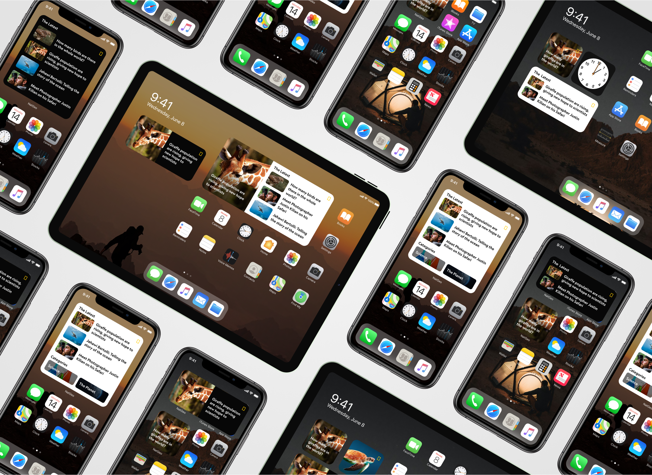
We wanted all sizes to convey the same information so we started by identifying the common structure and creating components. Each size had 2 variations: Article and Photo Gallery. As the widget containers become bigger, we show the user more data while keeping the specs the same for simple engineering.
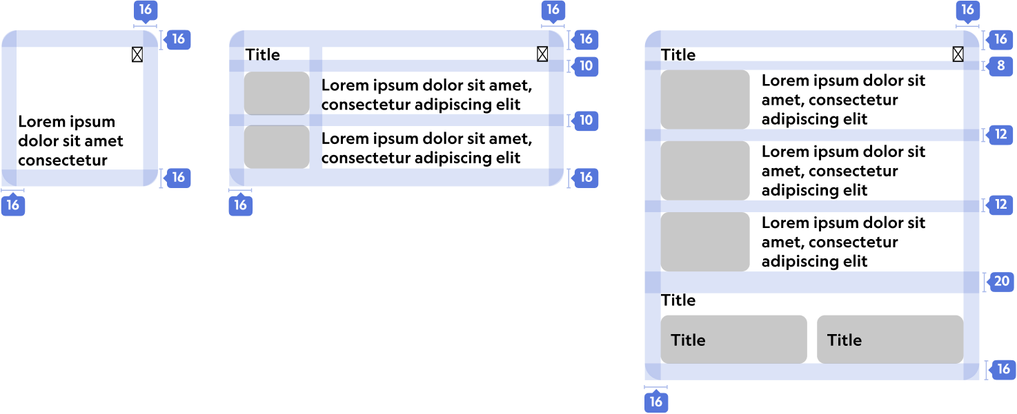
Content Exploration
Meta
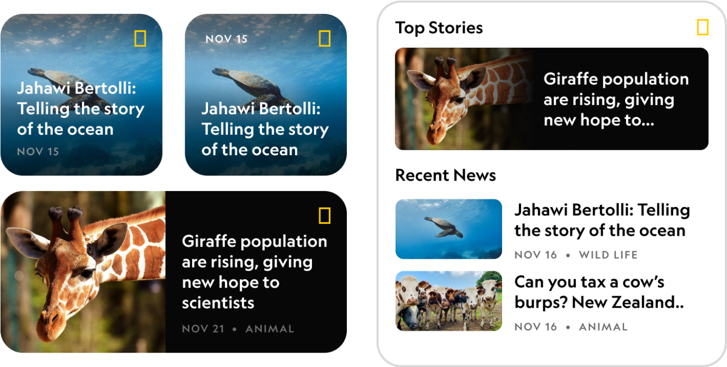
Explored the necessity of incorporating metadata (date) of the article, considering both its relevance to the widget's purpose and visual placement. Ultimately, we concluded that it would only added visual clutter and lacked relevance, especially since the widget would be updated multiple times a day showing most recent articles.
Topics
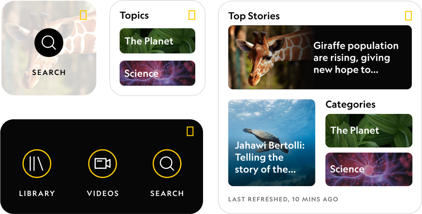
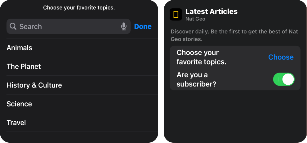
Another content type that was considered was adding topics for easier and direct access. Nat Geo currently has 5 topics: Animals, The Planet, History and Culture, Science, and Travel. Tapping these topics would take users to a hub page with more content about that topic. However, we decided not to stray away from it and instead only kept articles because users can already choose the topic they want in the "Edit Widget" setting. This kept the widgets focused on their main purpose, which is to showcase more articles.
Translating to ipad
When designing for x-large widget, which is only used in iPad, we had to consider scalability and content volume. Given the larger widget size, we wanted to carefully assess the amount of content to avoid unnecessary scaling.

Customization
In order to provide users with more flexibility, we enabled them to customize the widget by choosing the topics they want the content to be shown in. Additionally, the user can also define if they are subscribed or not to ensure the premium content surfaces the widget if they are a subscriber.
Visual Design
Content hierarchy
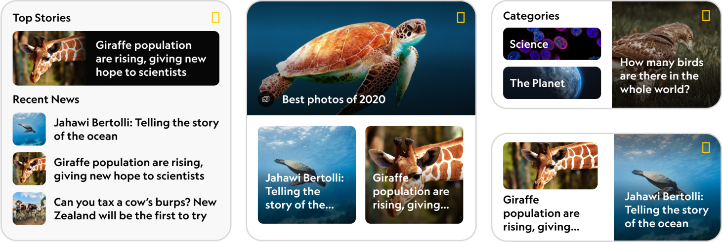
In the exploration phases, we went through many iterations to establish a clear visual hierarchy for the widget, ensuring both scannability and purposefulness. Our aim was to highlight one larger size article to capture the viewer's attention. We carefully considered text size, especially on busy images, to determine what is optimal for the eyes. Finding a balance between providing enough information without cluttering the widget was key.
Accessibility
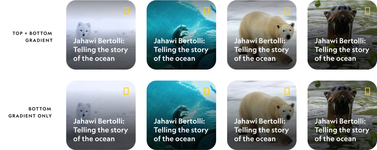
For this project, achieving accessibility was an important goal, with a focus on ensuring that all text is legible on our beautiful imagery. We tested various gradient ramps and the placement of gradients to enhance the overall user experience. By incorporating these considerations into the design process, we aimed to provide an inclusive user experience that caters to a diverse audience while maintaining the Nat Geo's aesthetic integrity across different modes.
Darkmode
In compliance with accessibility standards, we carefully implemented a color logic during the translation of designs from light mode to dark mode. For example, light mode Gray 80 color was mapped to the dark mode Gray 30. This approach guarantees that users can easily perceive and interact with the interface in both modes.


All Widgets
Small Size
Since the small widget only has one tap areas, the small Size widget includes a single article widget and a photo gallery widget.

Medium Size
Medium size widget includes a singular article for focality, along with more than one article widget.
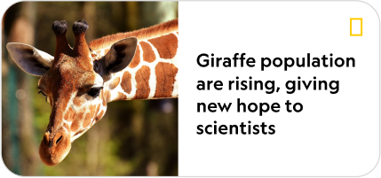
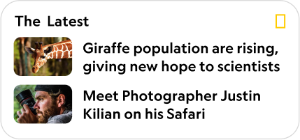
Large Size
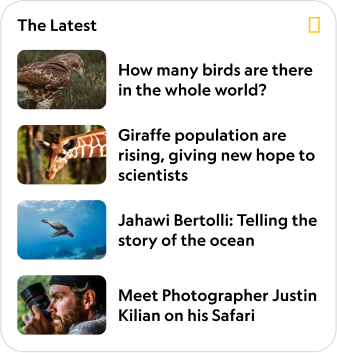
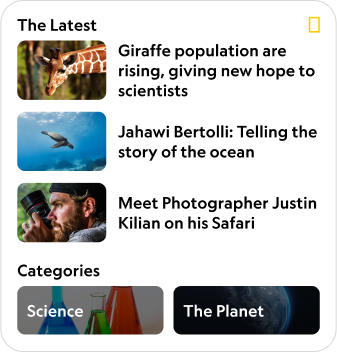
Large size widget includes, all articles, mixed content and photo gallery. Mixed content optimizes the space for 3 latest articles as well as 2 topics.
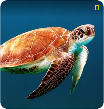
x-Large Size
X-large size, which is for iPad only, includes article widget and photo gallery widget.
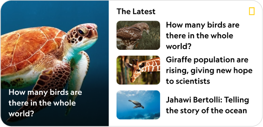
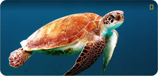
Always-On Widget
Lock screen widget is reduced in luminance to provide enough contrast and to ensure the article is legible.
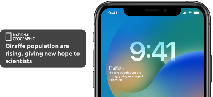
Error screen
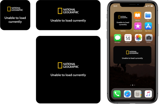
If the widgets were to not load due to technical or connectivity issues, it would display this error screen.
Braze Campaign
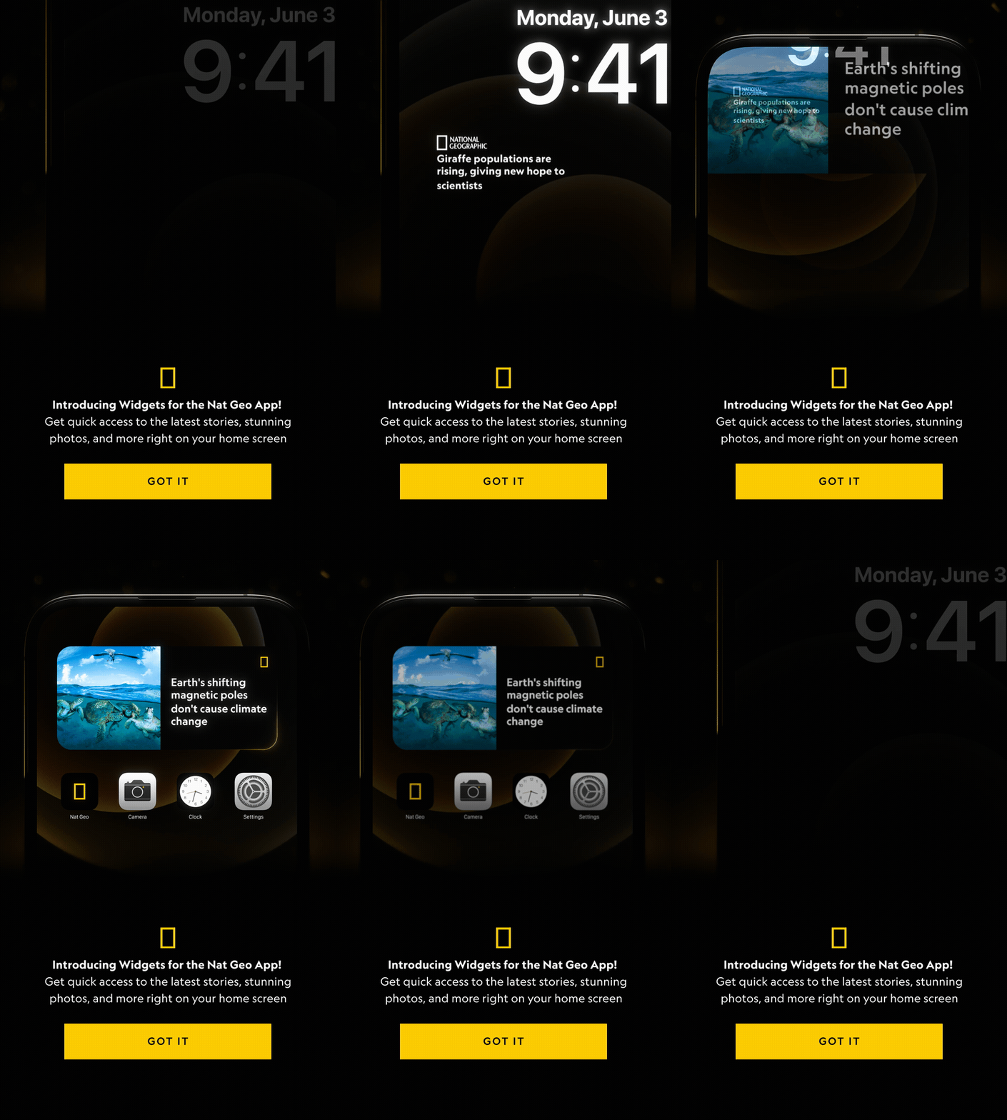
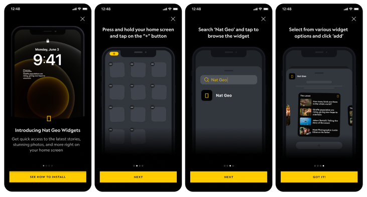
Braze, tool to push notifications to our consumers, campaign was created to introduce widgets and show users how to install them. The business goal was to encourage users to add widgets and increase engagement. I designed a series of screens to explain installation and collaborated with the motion team to create a gif for the initial screen.

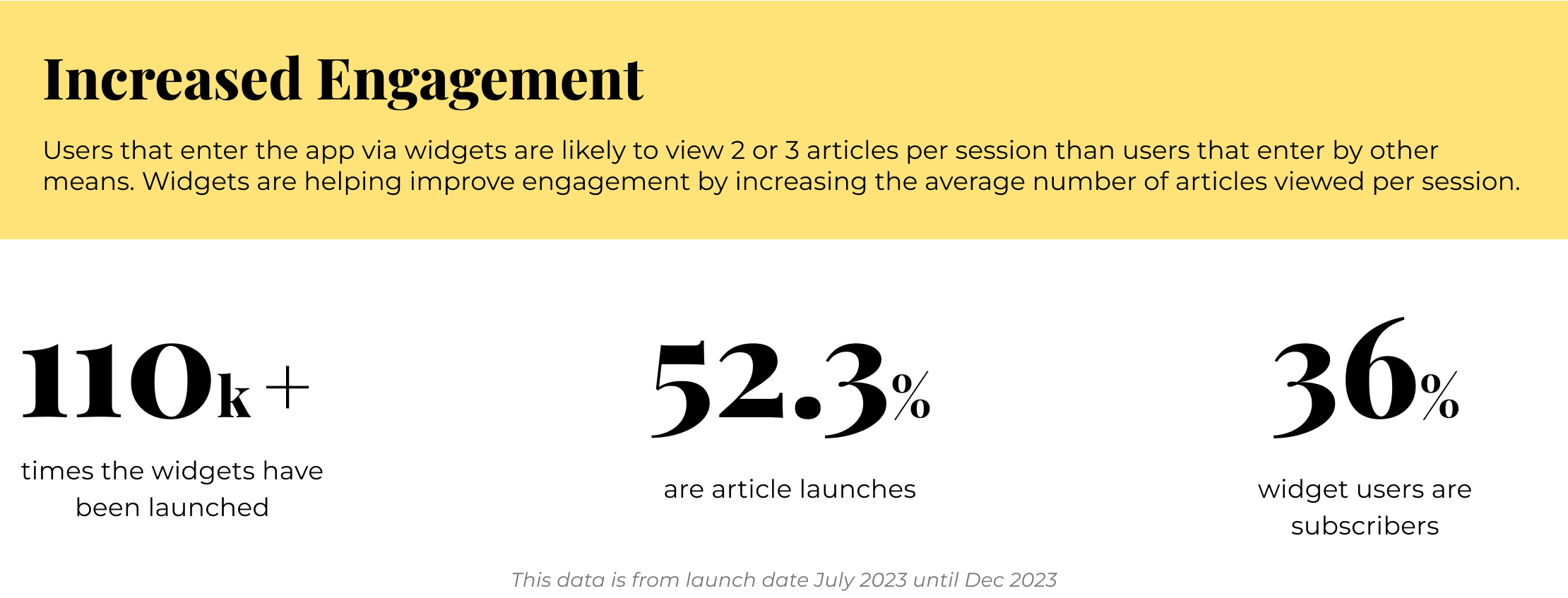
Components
To ensure consistency across all widgets and enable the design team to work efficiently, we created components. By identifying shared structures and recurring patterns, we developed a flexible framework that can be reused in future to advance components. This will also serve as a potential reference point for our other products and provide the design team with the versatility to streamline our workflow and maintain a cohesive design language.

Lessons + Takeaways
- Acquired knowledge of iOS native system capabilities and limitations while adhering to Apple guidelines
- Collaborated with product partners and served as a strong advocate for the design team to implement a brand new feature for Nat Geo native app
- Directly communicated with Engineers when technical issues arise and problem-solve jointly
View Other Case Studies
