ROLE
Lead Product Designer
TEAM
Product Designer, UX Researcher, Project Manager and Developers
LAUNCH DATE
Phase 1 – Aug 2024
Phase 2 – April 2025
OVERVIEW
The Global Navigation Redesign for National Geographic was a multi-phase initiative to improve discoverability, wayfinding, and SEO across NatGeo.com. The project modernized the site’s outdated 2017 information architecture, introducing a scalable navigation system with inline search, configurable promotional modules, and a logged-in profile panel to better surface Nat Geo’s vast content library.
OPPORTUNITY
User research showed the previous navigation exposed only five top-level topics, with an expansion click rate of just 0.8%. Users struggled to explore content breadth, hurting engagement and accessibility. This redesign aimed to create a intuitive, SEO-friendly system that increased discoverability and conversions.
MY ROLE
As the lead Product Designer, I owned end-to-end design process from from discovery through delivery, partnering with research, product, engineering, and editorial teams. I led competitive analysis, facilitated cross-functional workshops to define the information architecture and interaction patterns. I collaborated with the research team to run usability testing, and iterated on prototypes to address user feedback. I worked closely with engineering to ensure design fidelity and accessibility.
Immediate Impact (within 2 weeks of launch)
2x increase in navigation click-through rate
14% boost in time spent on site
9x expansion in the number of content accessible with a single click.
4x improvement in total SEO score and double the number of crawlable homepage links. More detailed impact at the end of the project.
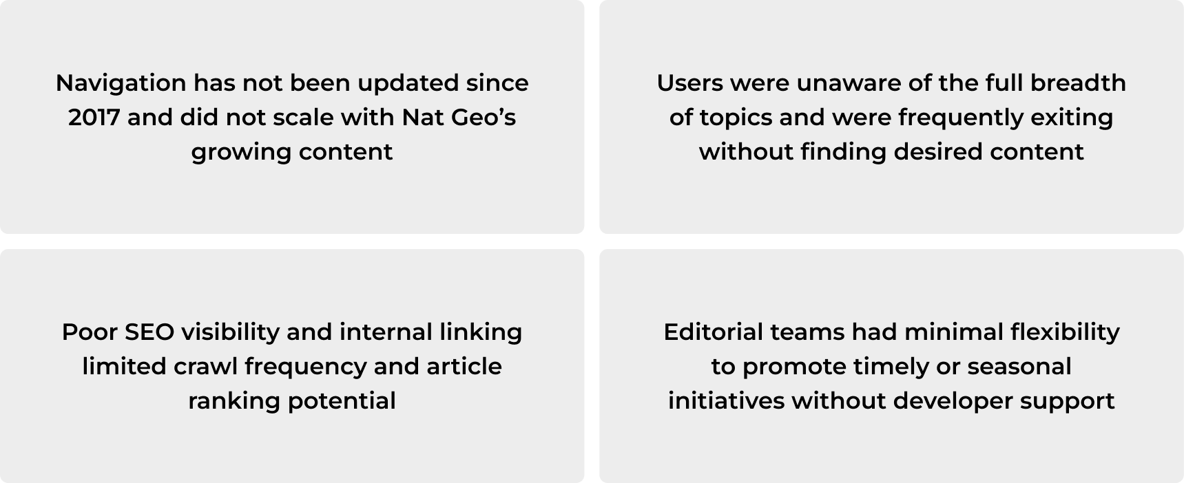
Problem
The existing Nat Geo navigation had not been updated since 2017 and failed to scale with the brand’s expanding content. Users struggled to find topics, leading to early exits, while weak SEO and internal linking limited content visibility and article ranking. Additionally, editorial teams lacked flexibility to highlight timely or seasonal initiatives without developer assistance.
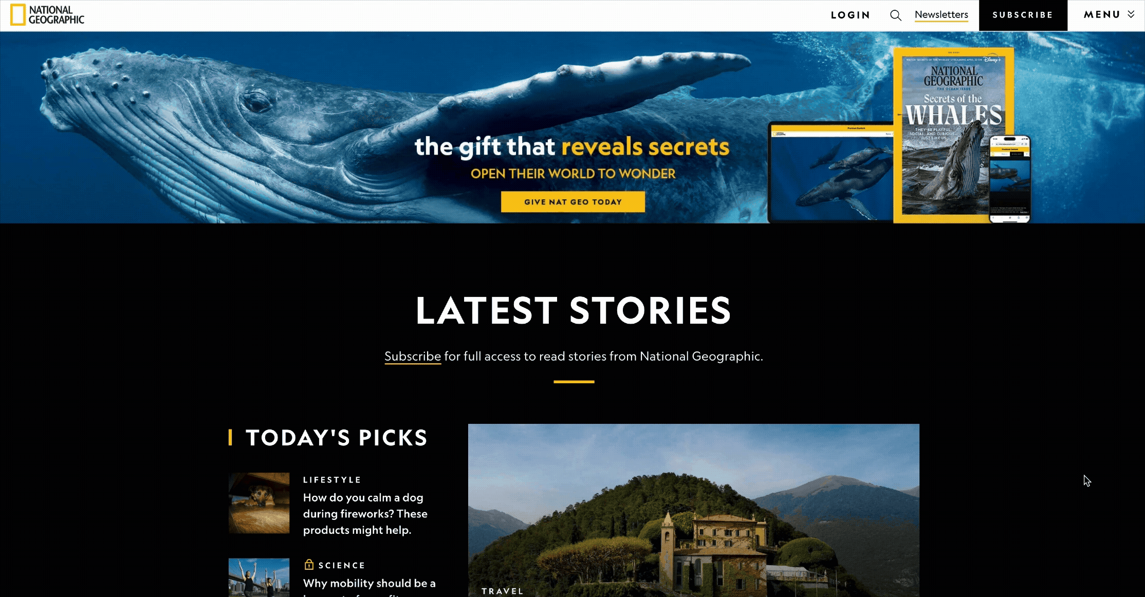
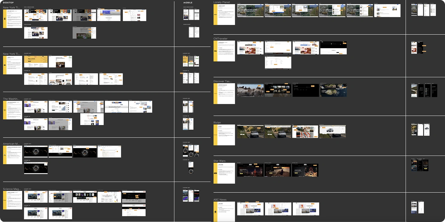
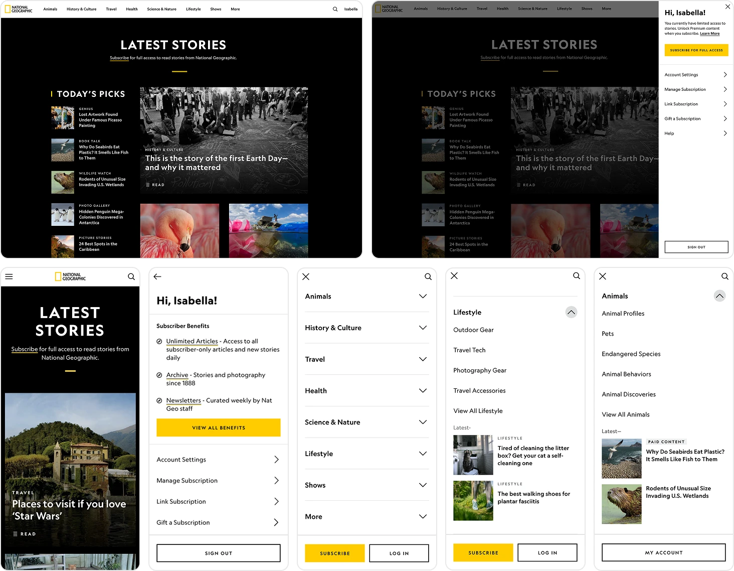
Pre-Redesign Desktop and Mobile Experience

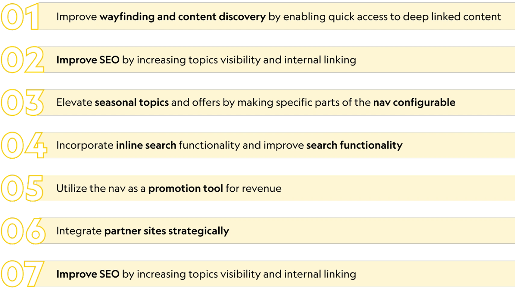
Solutions
The redesign focused on improving wayfinding, content discovery, and SEO through better linking and topic visibility. It introduced configurable navigation for seasonal content, inline search for easier access, and promotional modules for revenue opportunities. The new system also integrated partner sites strategically and empowered teams with more control and agility.
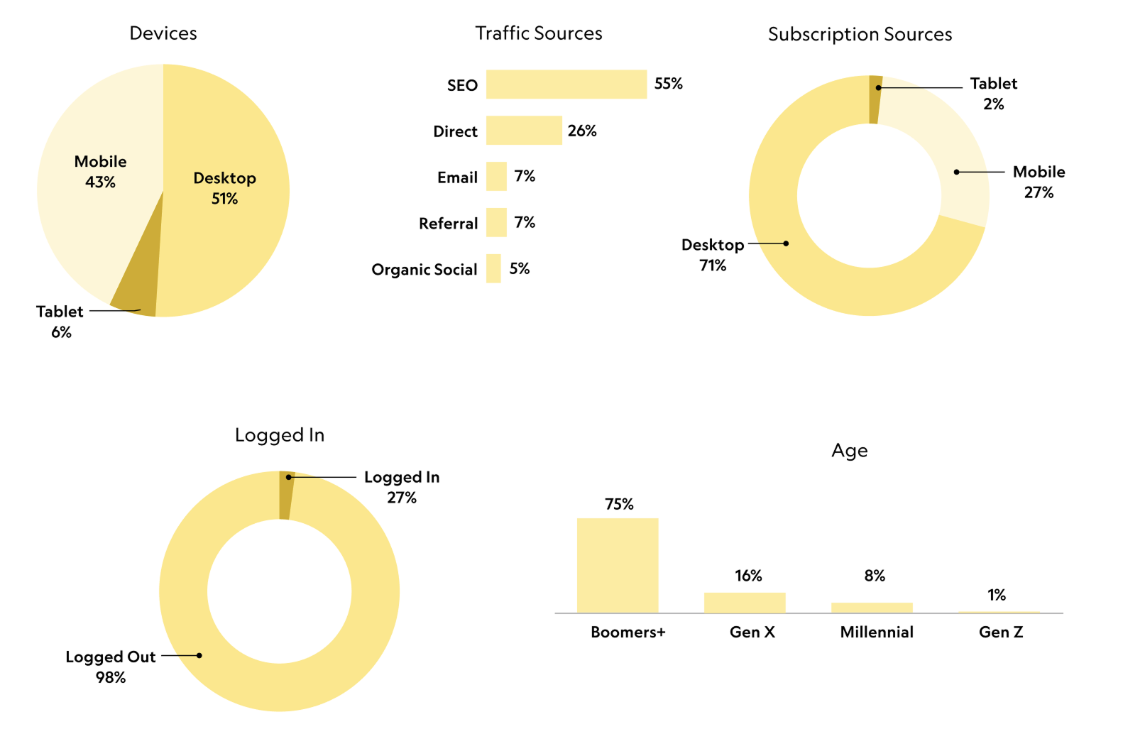
Platform Usage Breakdown
Most of the traffic splits pretty evenly between mobile and desktop. Most users find the site through SEO or direct visits, but when it comes to subscriptions, about 71% happen on desktop and 27% on mobile which was a big consideration for the new nav. The majority of visitors are logged out and boomers are the leading audience.
Discovery Phase
Analytics Review
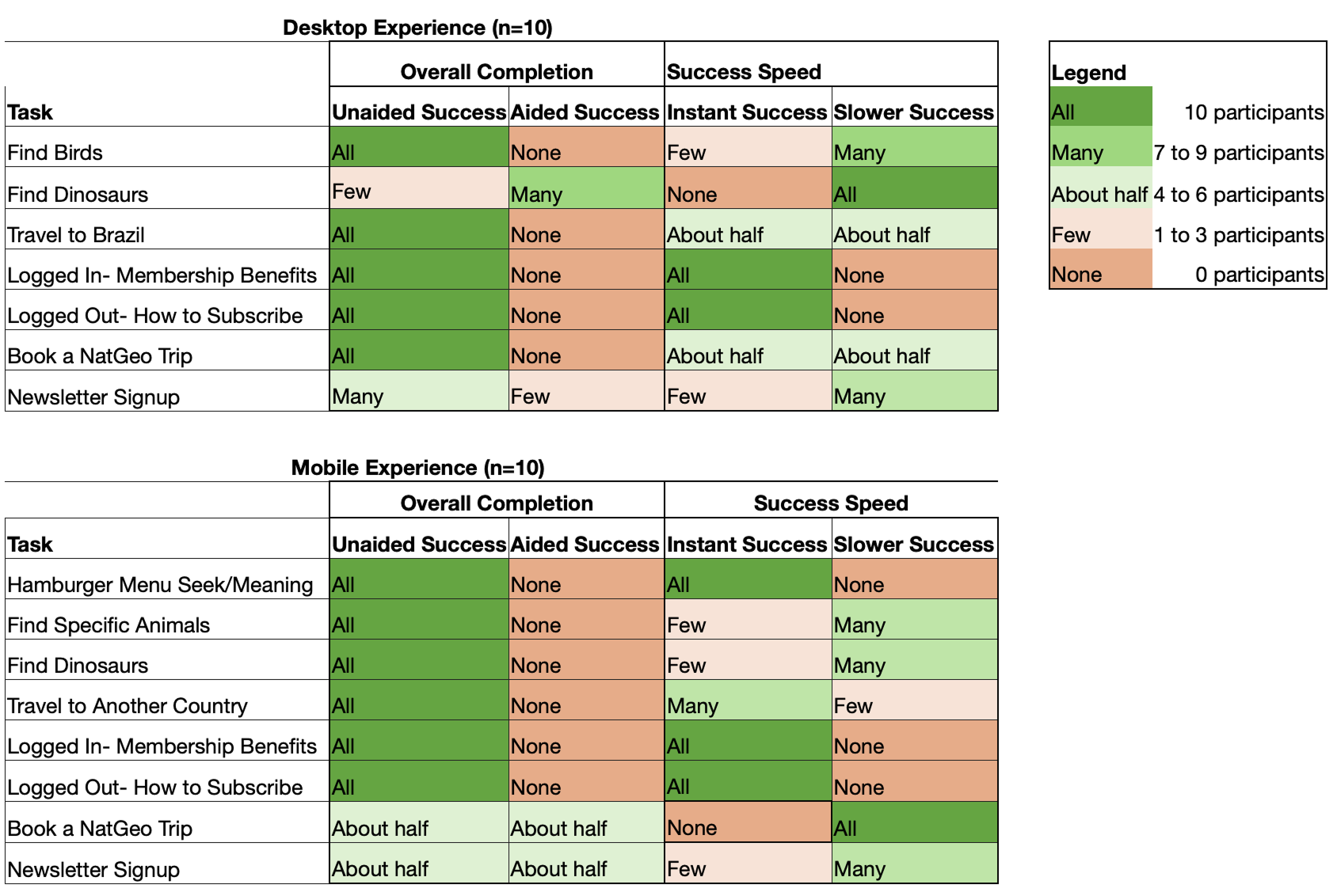
We analyzed navigation usage patterns across desktop and mobile, including interaction frequency, time spent, click behavior, and post-navigation drop-off. Navigation usage was 3x higher on desktop than mobile, with users spending an average of 30 seconds interacting with the menu. Search was the most-used navigation entry point, while newsletter access saw the lowest engagement. Only 0.7% of users expanded the full navigation menu, and within the menu itself, Animals was the most-clicked topic across both platforms.
Stakeholder Interviews
We conducted seven interviews with 17 stakeholders across customer care, editorial, marketing, ad sales, technology, and leadership, including Nat Geo’s Editor-in-Chief, Nathan Lump. Feedback was unanimous: the existing navigation was overly reductive and failed to represent the depth of Nat Geo’s content. Stakeholders also emphasized the need for greater editorial control to use navigation as a promotional surface. Additionally, search surfaced as a major pain point, with consistent frustration around poor relevance, lack of filtering, and limited sorting capabilities.
Competitive Analysis
I reviewed 15 best-in-class competitors across media, news, travel, and Disney brands, spanning both subscription and non-subscription experiences on desktop and mobile. While implementations varied, clear patterns emerged: expanded menus were the norm, visual cues within navigation helped drive engagement, and the strongest experiences were intentionally designed for mobile-first usability. These insights informed both structural and interaction decisions for the new navigation system.
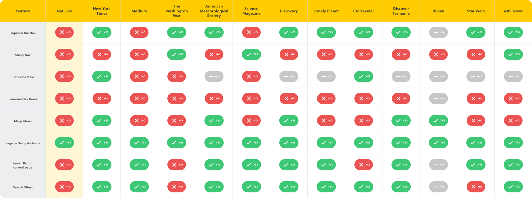
Feature Matrix
I put together a Feature Matrix to compare our features amongst our competitors.
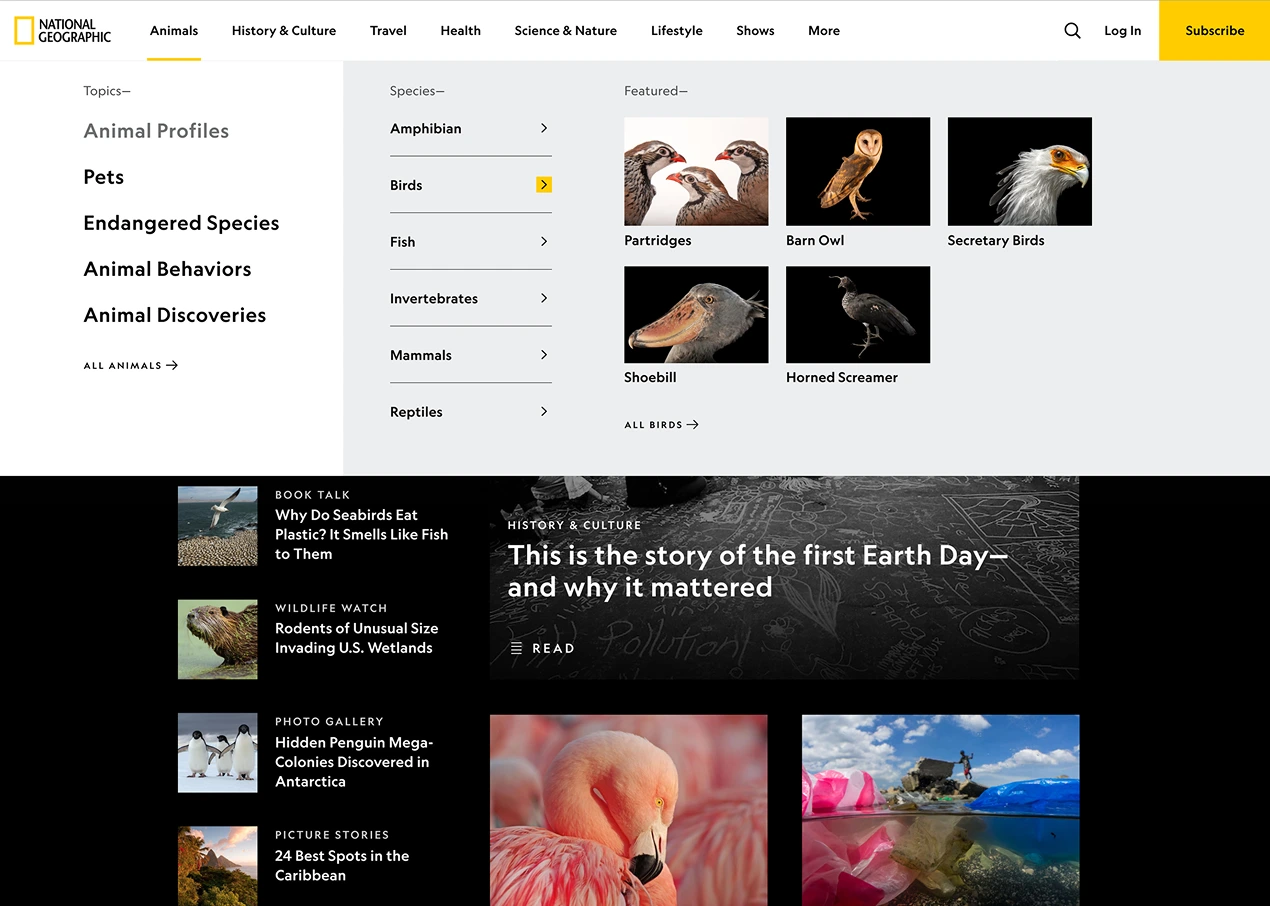
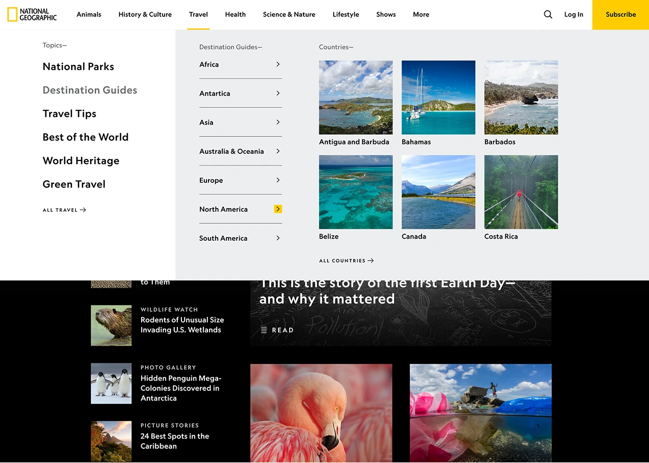
Information Architecture
We evaluated existing IA patterns and ran a card-sorting exercise with the product team to understand how users naturally group and prioritize content. We explored three IA models with different organizational approaches and refined toward a topic-based structure that made the most sense both categorically and strategically. Topics were prioritized using a combination of analytics (high engagement, search volume, and growth trends), editorial focus areas, and business priorities tied to key initiatives and revenue. Ultimately, topic-based IA better matched user expectations and allowed us to surface significantly more content at higher levels.
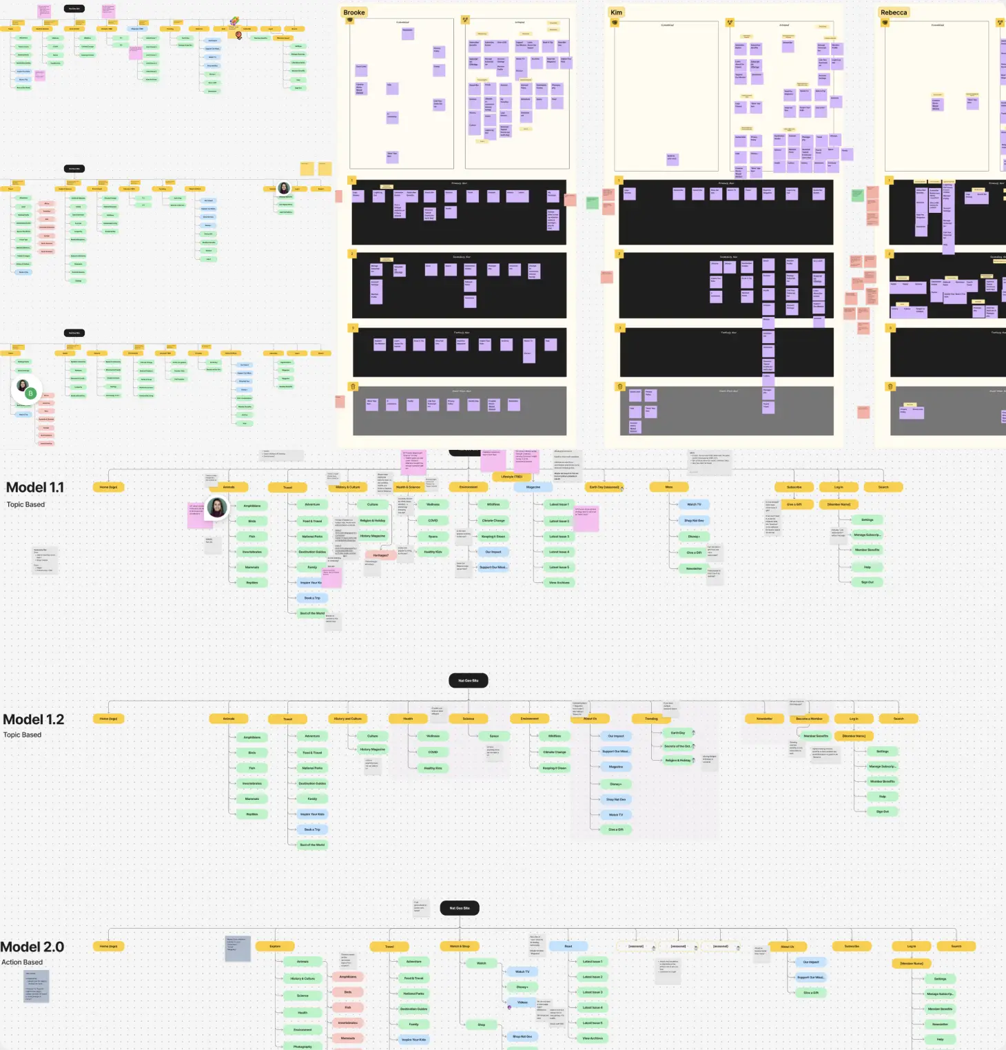
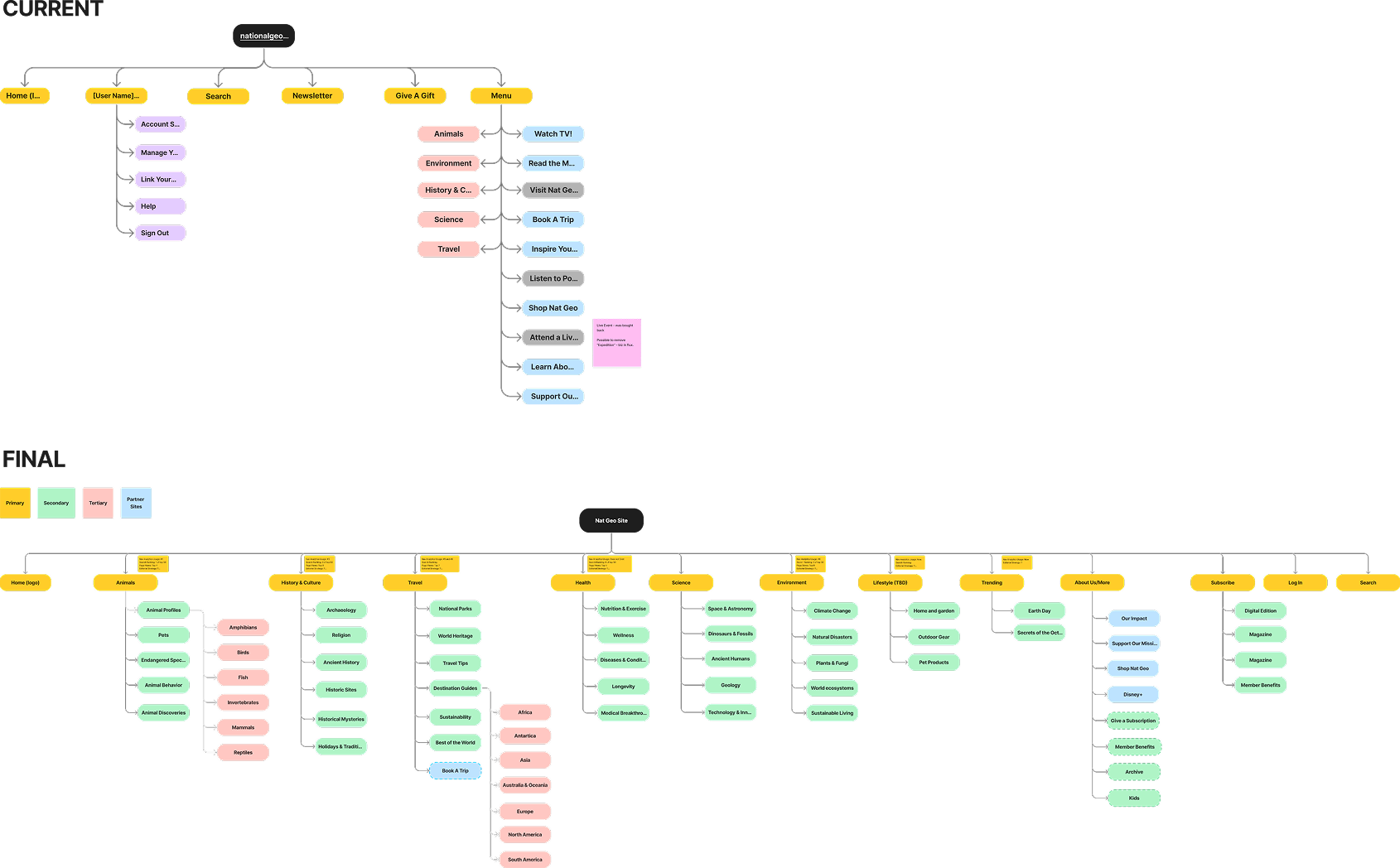
For comparison, see below what the current live IA looks like vs what we proposed. The final structure showcases the depth of Nat Geo’s offerings and was developed in close collaboration with Nathan Lump and the editorial team to align user needs with business priorities.
KPIs
Our success is measured through a combination of engagement, discoverability, and SEO performance metrics, segmented by desktop and mobile. Core KPIs include:
- Increased global navigation click-through rate
- Growth in unique visitors to featured hubs and topic pages
- Improved SEO outcomes such as faster indexation and higher crawl rates on the homepage and hub pages.
- Additional analytics: track increases in search usage, time spent on site among users who interact with the navigation, and downstream engagement with key modules, including Disney+ content, featured stories, promotional placements, and the user benefits panel

Phase 1
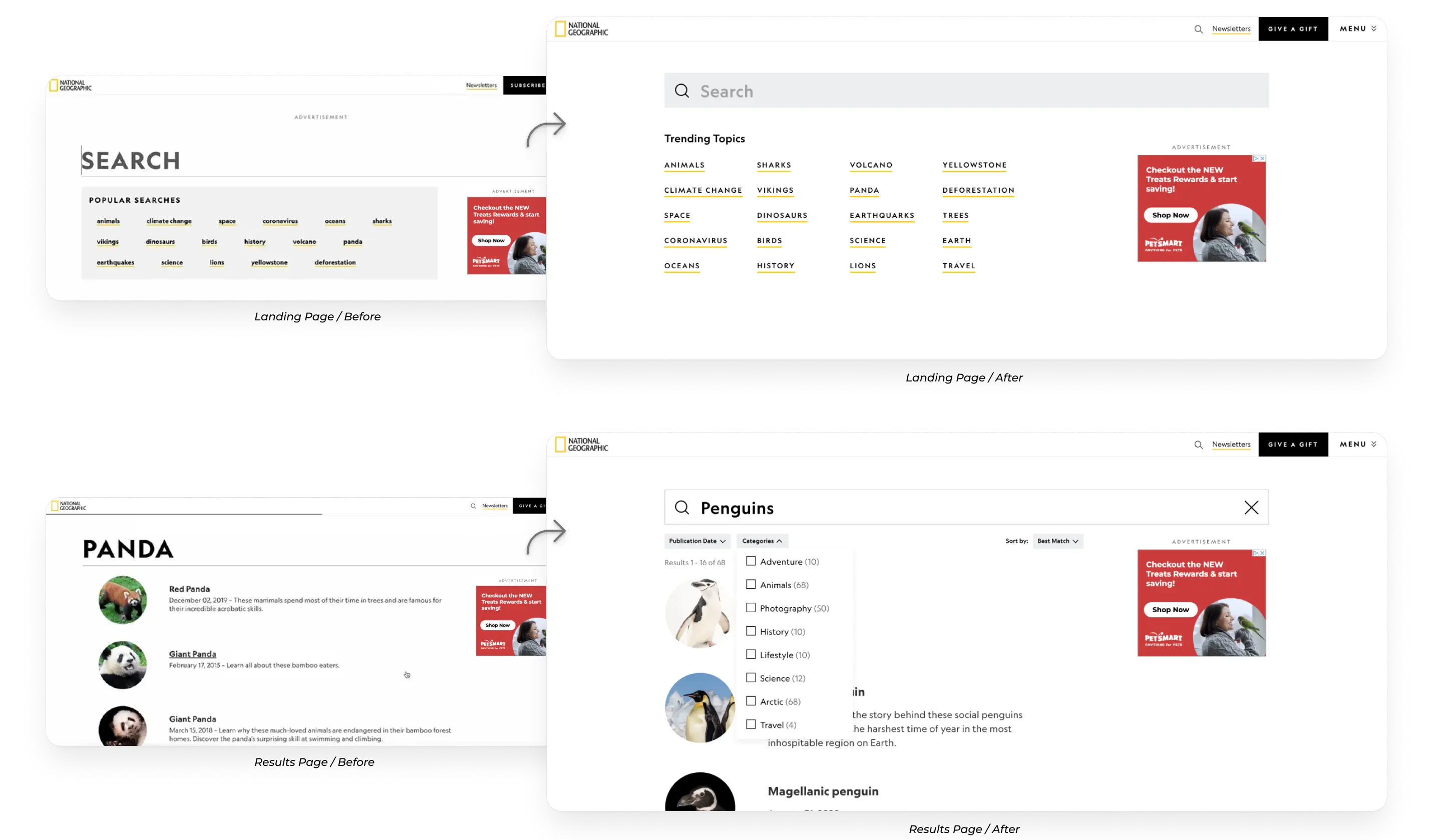
Search Tool Improvements
Phase 1 focused on improving Nat Geo’s internal search experience through quick, low-resource enhancements while the larger global navigation redesign was still in progress. By taking an agile approach, we were able to ship meaningful improvements early, gather real user data, and reduce risk ahead of the broader navigation overhaul.
Opportunity
Search was a persistent pain point for both users and stakeholders. The existing experience surfaced outdated or irrelevant results, lacked basic sorting and filtering, and followed an outdated page flow that made discovery difficult. Given the scale and depth of Nat Geo’s content library, search needed to function as a reliable, efficient entry point for users looking to find relevant content quickly.
Key Features:
- Inline search from the global navigation
- Three new filtering and sorting dropdowns on the NatGeo.com search page:
- Sort by: best match (default), most recent
- Refine by: Publication date (last week, last month, last year)
- Refine by: Categories (dynamic based on the search query)
- Improved search algorithm to surface relevant and recent results higher
- Type-to-search functionality to suggest search terms as the user types
- Display number of search results
- Improved ‘no results’ messaging
- Modernizing popular searches module & search bar
Impact
Phase 1 launched on in Aug 2024 and it delivered strong, measurable gains across platforms:
- +24% increase in attempted searches across mobile and desktop
- +12% increase in click-through rate from the search results page
- +55% increase in total search icon clicks overall
- +151% increase in search icon clicks on mobile, driven by improved visibility in the global navigation
Phase 2
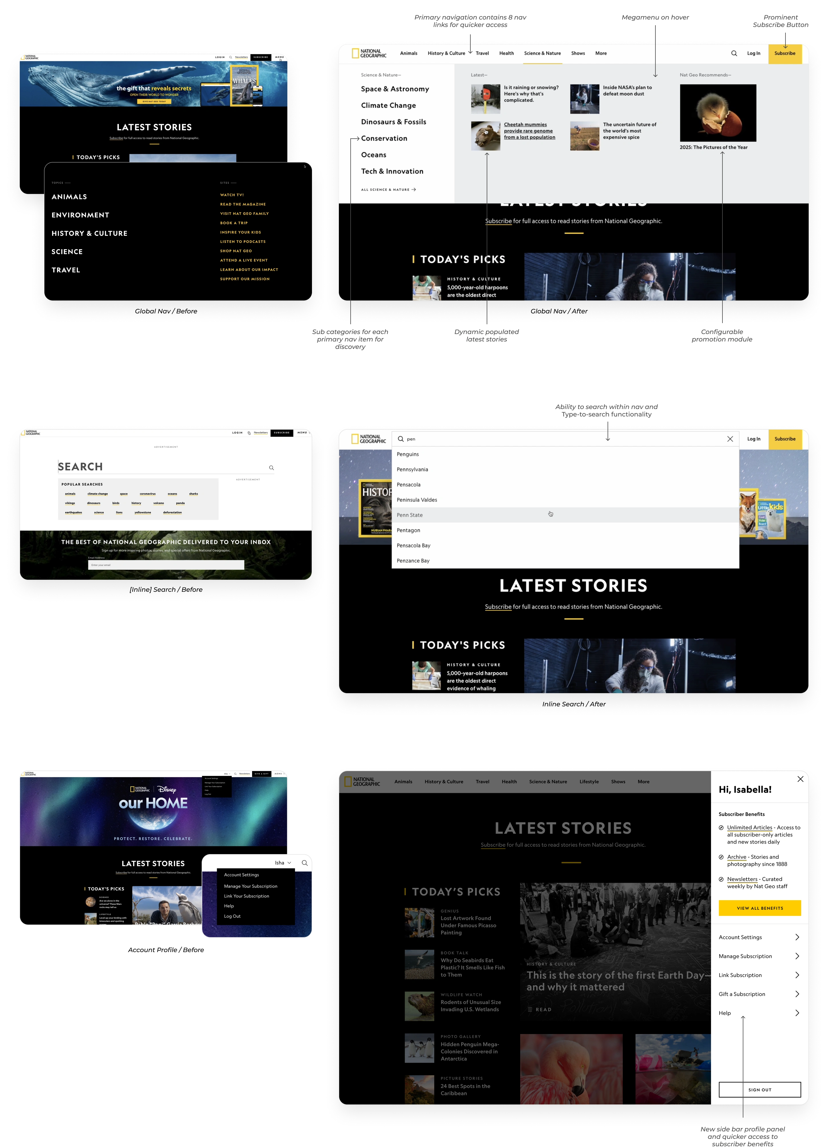
Phase 2 focused on the actual Global Navigation Redesign including building the nav from the ground up, and conduct user testing.
Key Features:
- Redesigned primary navigation containing eight strategically-chosen primary categories
- Megamenu dropdown containing:
- Secondary topics
- Dynamically populated latest stories
- Configurable right-hand promotional module to showcase content and conversion opportunities
- Configurable section to highlight Nat Geo series and specials
- User profile panel to promote benefits and upsell opportunities
- New section in back-end CMS tool for content creators to manage configurable sections
- Inline search
Subscribers vs Non-subscribers
We designed the navigation and profile panel to account for three distinct user states: logged-in subscribers, logged-out users, and logged-in non-subscribers. For subscribers, the profile panel prioritized quick access to benefits, account details, and utility links. For logged-out users, the experience emphasized discovery while keeping authentication accessible. For logged-in non-subscribers, we used the profile panel as a conversion surface, clearly communicating limited access and encouraging subscription through contextual.
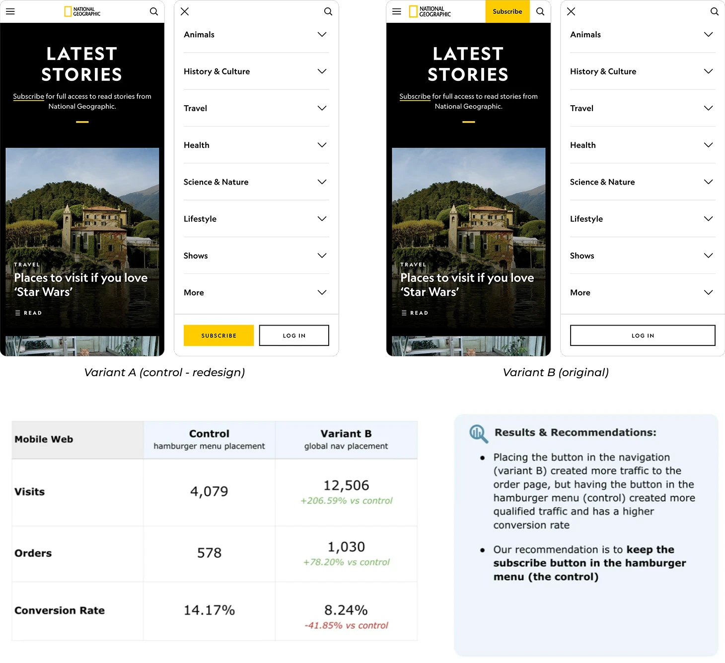
On mobile, we made a deliberate decision to relocate the Subscribe CTA from the primary navigation into the hamburger menu. While initially controversial, this decision was grounded in data: current click-through and conversion metrics showed that surfacing the CTA persistently in the primary nav was not driving meaningful conversions. Instead, we placed Subscribe and Log in as sticky actions at the bottom of the menu, ensuring they remained always accessible while making the action more intentional. This required close alignment with marketing stakeholders, and we ultimately gained buy-in by clearly articulating the rationale and expected impact based on existing data.
User Research Testing
Given the scale of this high-visibility change, user validation was essential. We partnered with Toluna, a third-party research firm, to design the recruitment screener, interview guide, and moderator notes. Collaborating closely with their team was a strong learning opportunity and helped ensure rigor and consistency across sessions.
We conducted 20 qualitative interviews across four flows: desktop subscriber, desktop non-subscriber, mobile subscriber, and mobile non-subscriber. Using high-fidelity prototypes, participants completed tasks such as locating specific content categories, finding member benefits, and discovering gifting options. This approach allowed us to assess both category placement and overall content discoverability across logged-in and logged-out states. The research helped us validate our direction while identifying clear opportunities to refine clarity and usability before launch.
Key Insights & Iterations:
- Strong validation of the navigation framework: Users consistently found the structure logical, easy to navigate, and effective at showcasing the breadth of Nat Geo’s content. Key areas like member benefits and profile access were easy to find, reinforcing the overall IA direction.
- Improved clarity through clearer labeling and context: Some sections, particularly Trending, lacked clear intent. We addressed this by testing clearer naming, adding descriptive context, refining visuals, and introducing cues like headlines and Disney+ badges to better communicate purpose.
- Refined mobile discoverability and hierarchy: Mobile users experienced friction due to excessive scrolling and unclear hierarchy. We improved this by snapping expanded sections to the top of the viewport, clarifying “View All” actions, and repositioning high-value links like Book a Trip for better visibility.
A/B Test
After launching the global navigation, the business observed a short-term dip in subscription orders on mobile, and the immediate pressure was to revert to the previous design. I pushed back on reverting prematurely and advocated for an A/B test, as early signals showed conversion rates remained strong, suggesting higher-quality traffic rather than a true performance regression.
We ran a controlled 4 week mobile web experiment comparing the launched experience (Subscribe in the hamburger menu) with a variant that restored the CTA to the top navigation. While the top-nav placement drove more traffic to the order page (+206% visits, +78% orders), it converted significantly worse (–41% conversion rate). The hamburger-menu placement generated fewer but more qualified visits, resulting in higher overall conversion efficiency. Based on these results, we aligned on keeping the Subscribe CTA in the hamburger menu and reinforced a data-driven approach over reactive design changes.
Documentation
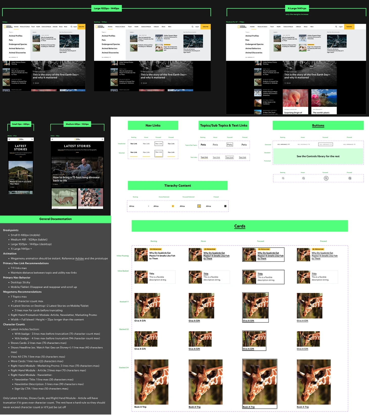
I created comprehensive documentation covering all responsive breakpoints, from small mobile through large desktop, clearly defining when content truncates, reflows, or transitions into mobile layouts. This included detailed guidance on content prioritization, character limits, and truncation behavior, as well as fully specified interaction states and patterns across navigation links, buttons, cards, and tertiary content. By documenting these rules upfront, we ensured consistency across platforms, reduced engineering ambiguity, and enabled faster and more confident delivery at scale.
Post-MVP
The original design included surfacing high-value tertiary content, such as Animal Profiles under Animals and Destination Guides under Travel, directly within the menu, since these are among the most popular and frequently accessed content on the site. The goal was to reduce the number of clicks required for users to reach key content by exposing deeper layers earlier in the navigation. Due to the higher engineering effort required, this enhancement was scoped to post-MVP, but we fully defined the interaction models, including hover behavior that dynamically reveals tertiary content.


Conclusion
- The new navigation has effectively guided users to a wider array of content, particularly on mobile and tablet devices, leading to increased time spent on the site
- The overall positive trends strongly suggest the redesign is aligning well with user needs and driving deeper content exploration
- The measurement goals for this program were to increase engagement and SEO via CTR, Hub UV’s, CTR from Search, (using avg time spent as a proxy metric) and to improve internal linking architecture
- Overall brand NorthStar metrics are lead generation and subscription conversion
View Other Case Studies