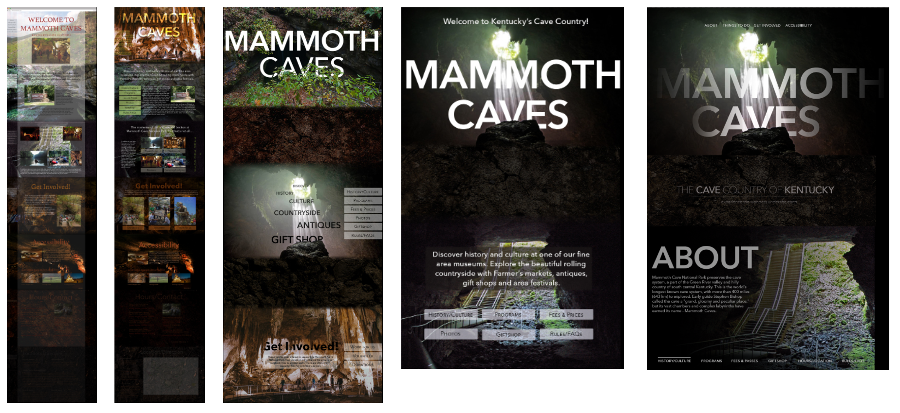

The National Park - Mammoth Caves
The purpose of the redesigned website is to create a rich, interactive experience for the user while actively engaging the site.
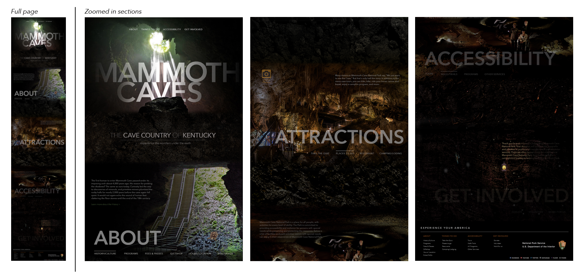
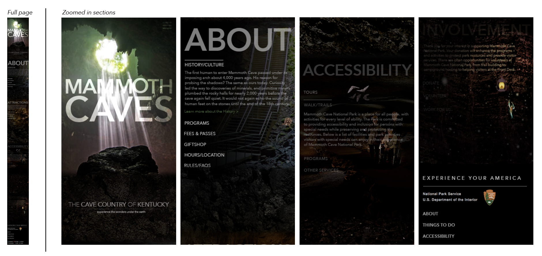
This website showcases entertaining information for visitors, essentially conveying them to visit the national park. Instead of entering in the website and just clicking into a page full of words and boring images, visitors can click into an exciting web design that immediately leaps off the screen to greet them. It has pop up elements, scrolling effects, and a feeling of what it is like
to visit the Mammoth Cave.
Full Website Run-through Video
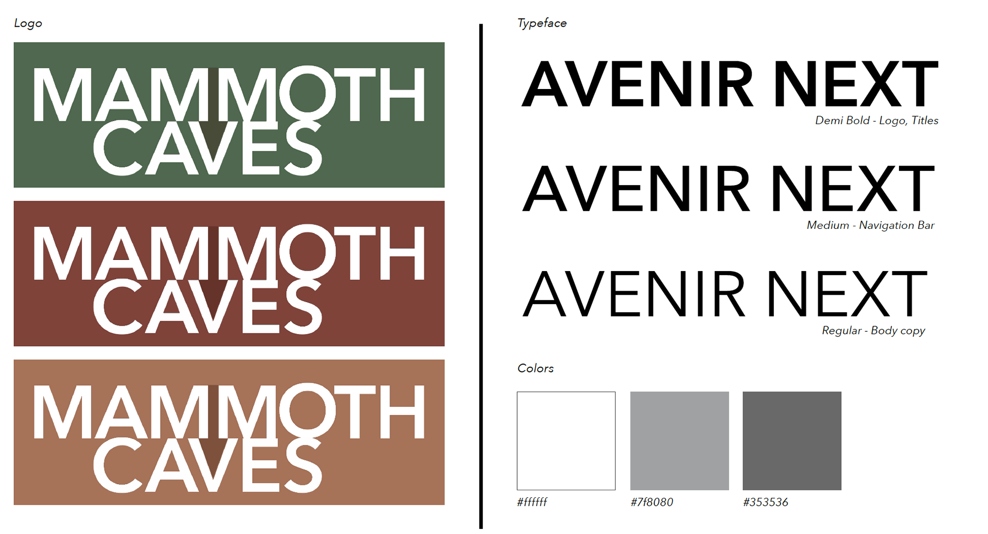
Branding
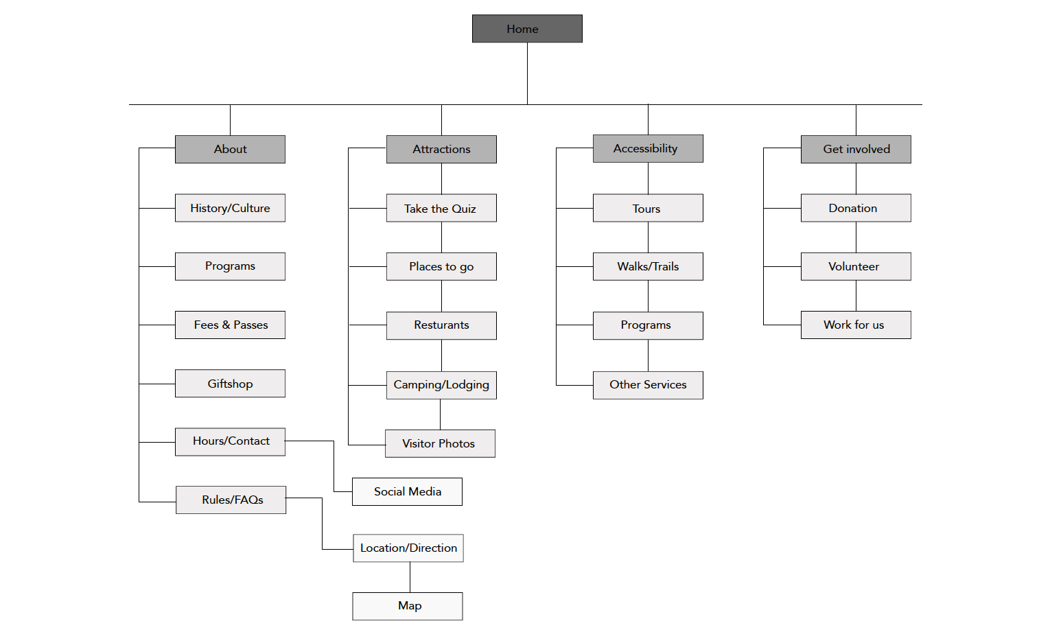
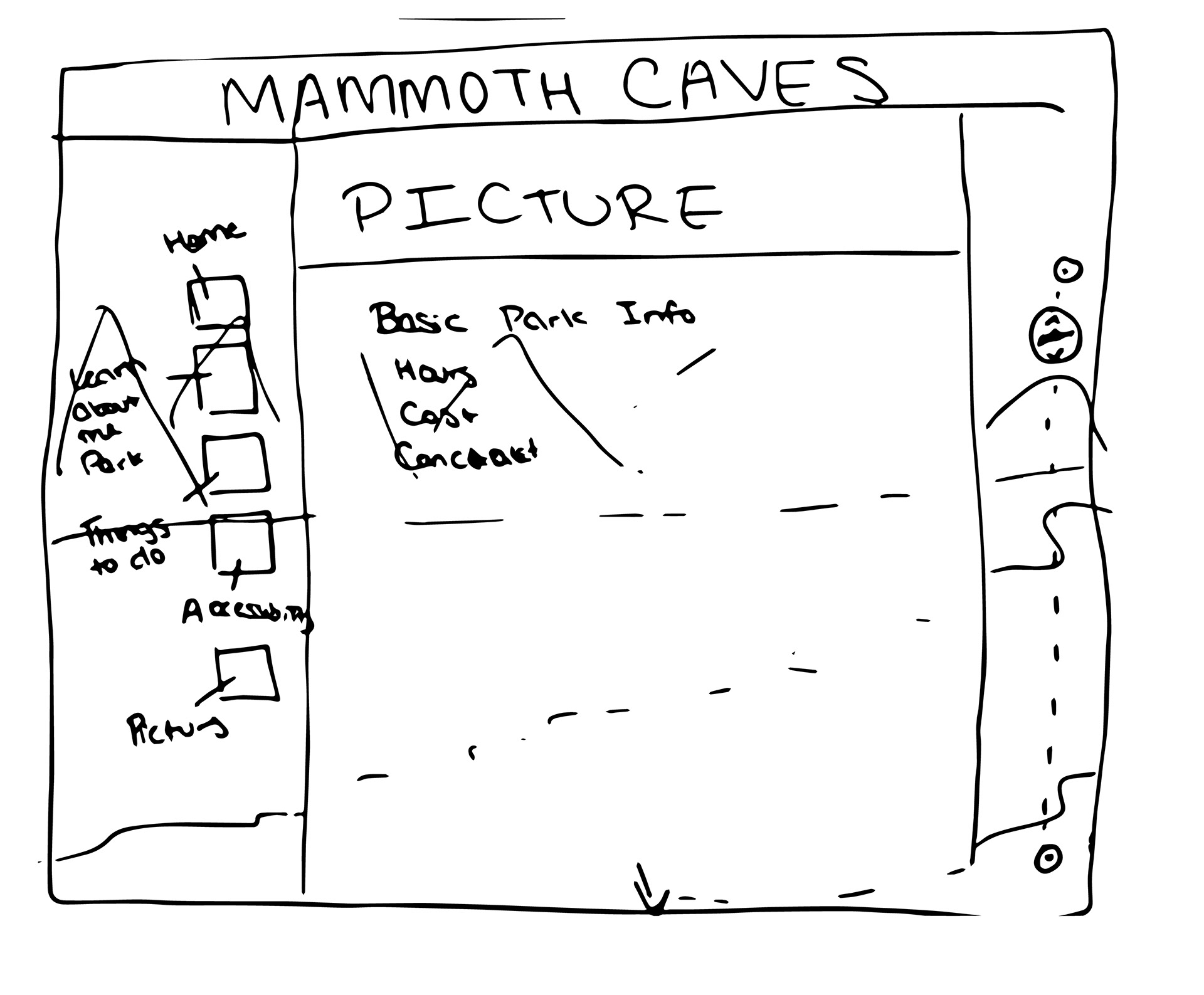
SiteMap
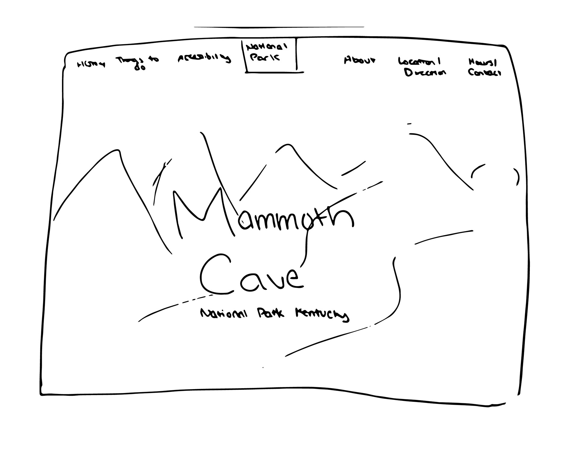
WireFrames
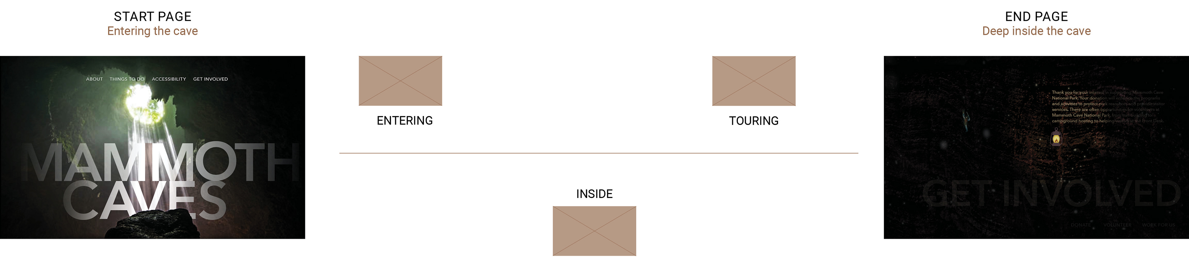
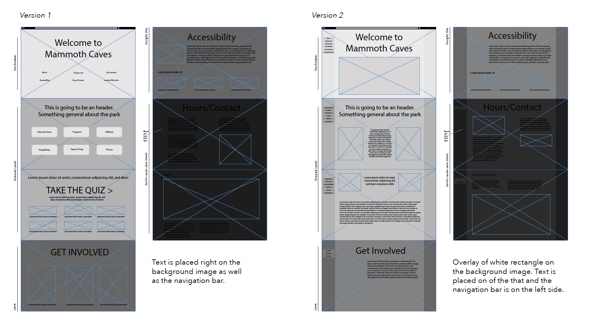
The purpose of this layout to display the emotion of caves. The landing page starts out bright and at the beginning of the cave and the deeper you go into the website (caves) the darker it gets.
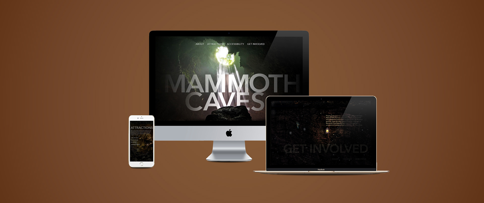
Final Website Display
Since the website is to site see a cave, this website takes you in deeper as you scroll further down. Which is why the site starts with the hole with the light shinning in. Eventually, when you get to the end (or in the bottom of the earth’s crust), the mouse
turns into a lantern.
turns into a lantern.
Responsive Design
For mobile screen, the titles and sub headers are on the background. As you click on each sub header, the description displays right below it, pushing the other headers further down.
Process and Insight
At start, I mainly focused on capturing the viewers attention as soon as they landed the site. Through a-lot of ideation and
trial & error, I developed my final design. The essential goal of the website is for the user to actively engage the website;
to communicate and interact with it.
trial & error, I developed my final design. The essential goal of the website is for the user to actively engage the website;
to communicate and interact with it.
Process and website re-design walkthrough
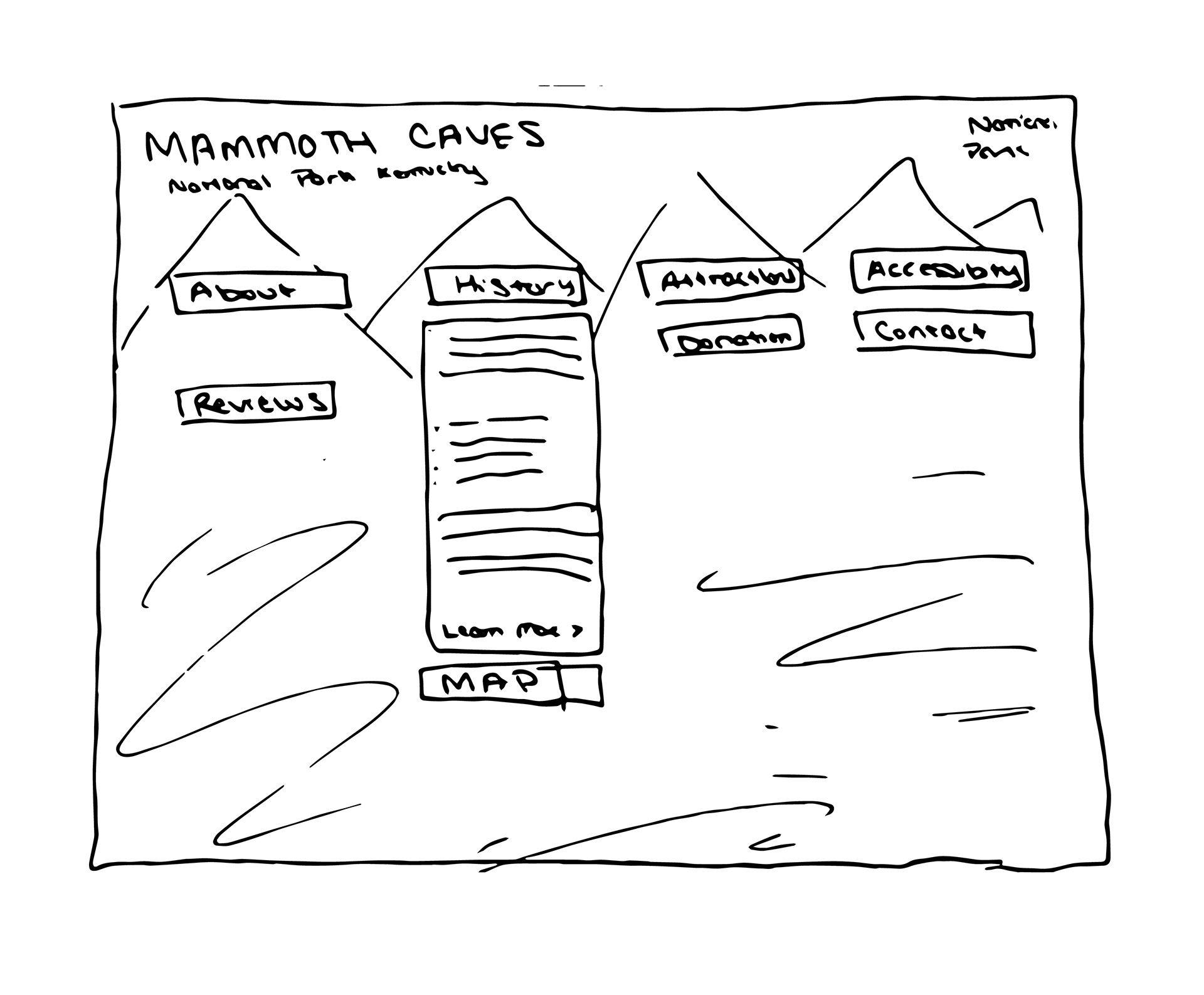
Insight 1: During the early sketching stage, I wanted to design a website with drop down menus and a single screen that would lead to the next screen, after a prompt action. However, I tried to stir away from "basic" elements that make up a website and wanted to create a concept that would only be justified for caves. Hence, I came up with the concept of taking the viewer deeper into the cave, as they would at an actual cave.
Sketches
Insight 2: By already using busy and high contrast images for the background, I decided to have the typography simple and clean. I tried using type effects, and clipping mask but realized it took away from the overall concept. After many typography experiments, I landed on Avenir Next Bold, with transparent white to give the high contrast, yet still the interaction element.
Home Screen Design Comps

Insight 3: Having a white overlay with text on top took away from its modern and enriching experience. After many prototypes, I decided to use darker images with text directing on it. I wanted the high contrast at the landing page to catch the viewers attention and engage them to scroll further.
Landing Page Design Comps